
- Input Overview
- Key Features
- Quick Start
- Input Controls
- Placeholder
- Button Types
- Text Alignment
- Dropdown Alignment
- Data Formatting
- Data Parsing
- Data Validation
- Input Masking
- Handling Errors
- Handling Null and Empty Values
- Culture Settings
- Keyboard Navigation
- Appearance and Styling
- Themes
- Command Binding
ToggleSwitch
The C1ToggleSwitch control allows users to switch between two states (On and Off), which causes an immediate effect. Inspired by Fluent Design principles, the control theming, and custom content for each state.
Key Features
Fluent Design Compliance: Matches modern Microsoft design guidelines
Touch Support: Supports tap and swipe gestures for touch-enabled devices
Customizable Appearance and Content: Customize the switch's appearance with rich style and layout options, and display text or icons for both states
Elements
| State Name | Off | On |
|---|---|---|
| Default | 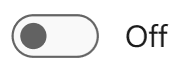 |
 |
| Hot | 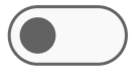 |
 |
| HotPressed | 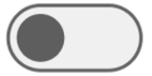 |
 |
| Pressed | 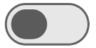 |
 |
| Disabled | 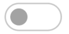 |
 |
Customization
The C1ToggleSwitch provides numerous options to customize your application’s design:
LabelDisplayMode
Set whether the toggle displays text (default) or icons:
LabelDisplayMode.Text
LabelDisplayMode.Icon
To assign icons:
- Select the toggle in the Designer
- Set OnIcon and OffIcon to C1Icon (e.g. C1BitmapIcon)
- Click on Source to import a new media asset
LabelPosition
ToggleSwitch has three display modes to display the position of text or image to represent the states:
- Left
- Right
- Inside (default)
Usage Sample:
//Label Position
c1ToggleSwitch1.LabelPosition = LabelPosition.Left; //Right, Inside
Styles
Users can customize the toggle’s appearance through the Styles property:
Customizable Style Options:
| Elements | Subcategory | Customizable Properties |
|---|---|---|
| General | Padding, Margins, Font | |
| Default / Disabled | ForeColor, BackColor, BorderColor | |
| Thumb | Border, Rounded | |
| OnState / OffState | BackColor, BorderColor, Margins (for each: Default, Hot, HotPressed, Pressed, Disabled) | |
| Bar | Border, Rounded, Margins | |
| OnState / OffState | BackColor, BorderColor, Margins (for each: Default, Hot, HotPressed, Pressed, Disabled) |
The following code demonstrates how to set the default background color of the toggle to Coral and applies a border of 4 pixels to the bar.
c1ToggleSwitch1.Styles.Default.BackColor = Color.Coral;
c1ToggleSwitch1.Styles.Bar.Border = 4;
The following code demonstrates how to create a rectangle ToggleSwitch with no margin.
c1ToggleSwitch1.Styles.Bar.Rounded = false;
c1ToggleSwitch1.Styles.Thumb.Border = 1;
c1ToggleSwitch1.Styles.Thumb.OffState.Default.Margins = 0;
c1ToggleSwitch1.Styles.Thumb.OffState.Hot.Margins = 0;
c1ToggleSwitch1.Styles.Thumb.OffState.HotPressed.Margins = 0;
c1ToggleSwitch1.Styles.Thumb.OnState.Default.Margins = 0;
c1ToggleSwitch1.Styles.Thumb.OnState.Hot.Margins = 0;
c1ToggleSwitch1.Styles.Thumb.OnState.HotPressed.Margins = 0;
c1ToggleSwitch1.Styles.Thumb.Rounded = false;