
- FlexGrid for WPF Overview
- Feature Comparison
- Quick Start
- Object Model Summary
- Data Binding
-
Features
- Columns
- Row
- Scrolling Modes
- Selection
- Sorting
- Cell Merging
- Custom Editors
- Custom Icon
- Transpose Data in Grid
- Data Grouping
- Data Filtering
- Data Aggregation
- Custom Cells
- Virtualization
- Paging
- TreeGrid
- Print Support
- Row Details Template
- Layout and Appearance: ClearStyle Technology
- Freezing and Pinning
- Import Data from Excel
- Export to Excel
- Clipboard Operations
- Validation
- FlexGrid Samples
Scrolling Modes
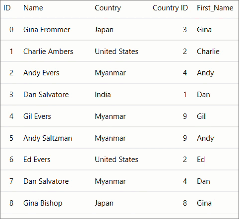
The ability to scroll by row or column in the FlexGrid control while dragging the scrollbar thumb improves data visibility and navigation through large datasets. This feature ensures complete column data is visible, reducing the need for excessive horizontal scrolling.
The ScrollMode property of the C1GridControl class can be used to enhance the display of row or column data while scrolling. The value of the ScrollMode property can be set by using the GridScrollMode enumeration, which provides the following two options:
| Options | Description |
|---|---|
| Pixel | Allows you to scroll the grid by pixels when dragging the scrollbar thumb. It is the default property. |
| Dimension | Enables you to scroll the grid by row or column when dragging the scrollbar thumb. |
The image below demonstrates the scrolling behavior of both rows and columns when the ScrollMode property is set to Dimension.
You can use the following code to set the value of the ScrollingMode property: This example uses the sample used in Quick Start topic.
xml
<c1:FlexGrid Name="grid" ScrollMode="Dimension" SelectionMode="MultiRange"/>
csharp
grid.ScrollMode = GridScrollMode.Dimension;
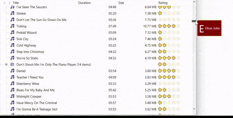
ScrollTip
FlexGrid ScrollTip for WPF is a convenient pop-up that helps provide users with context while fast scrolling through a large and complex set of data. It allows customization to display a wide range of information and UI elements such as plain texts, icons, formatted text, and layouts.
Quick Start
This guide shows how users can set up a simple ScrollTip.
Prerequisites
1. Visual Studio
2. C1.WPF.FlexGrid installed through NuGet
3. .NET 6.0+
Setting up Environment
1. Open Visual Studio and create a WPF Application
2. Drag and drop FlexGrid into your form
Enable ScrollTips in FlexGrid
There are two ways to enable ScrollTips in FlexGrid:
1. Subscribe to ScrollTipShown Event
You can enable ScrollTip in your FlexGrid by subscribing to the event. The following code shows how to subscribe and set its content.
flexGrid.ScrollTipShown += (s, e) =>
{
    if (e.Orientation == Orientation.Vertical)
       e.Content = $"Row: {e.Row}";
    else
       e.Content = $"Column: {e.Column}";
};
2. Using XAML with ScrollTipTemplate and ScrollTipStyle
FlexGrid ScollTip for WPF allows users to customize ScrollTip content to show a variety of information including text, icons, and images. This method uses the row's data as the context and does not require subscribing to the event. The following code shows how to define ScrollTip in your XAML using DataTemplate.
<c1:FlexGrid.ScrollTipStyle>
    <Style TargetType="ToolTip">
        <Setter Property="Background" Value="DarkRed"/>
        <Setter Property="Foreground" Value="White"/>
        <Setter Property="BorderBrush" Value="Yellow"/>
    </Style>
</c1:FlexGrid.ScrollTipStyle>
<c1:FlexGrid.ScrollTipTemplate>
    <DataTemplate>
        <Grid MaxWidth="300">
            <Grid.ColumnDefinitions>
                <ColumnDefinition />
                <ColumnDefinition />
            </Grid.ColumnDefinitions>
            <TextBlock FontSize="38" Text="{Binding Artist,Converter={StaticResource FirstCharConverter}}" VerticalAlignment="Center" />
            <TextBlock Text="{Binding Artist}" Grid.Column="1" VerticalAlignment="Center" TextTrimming="CharacterEllipsis" Margin="4 0 0 0" />
        </Grid>
    </DataTemplate>
</c1:FlexGrid.ScrollTipTemplate>