Creating chart from pivot table

Posted by: dpandey on 26 November 2025, 5:23 pm EST

  • Posted 26 November 2025, 5:23 pm EST - Updated 26 November 2025, 5:32 pm EST

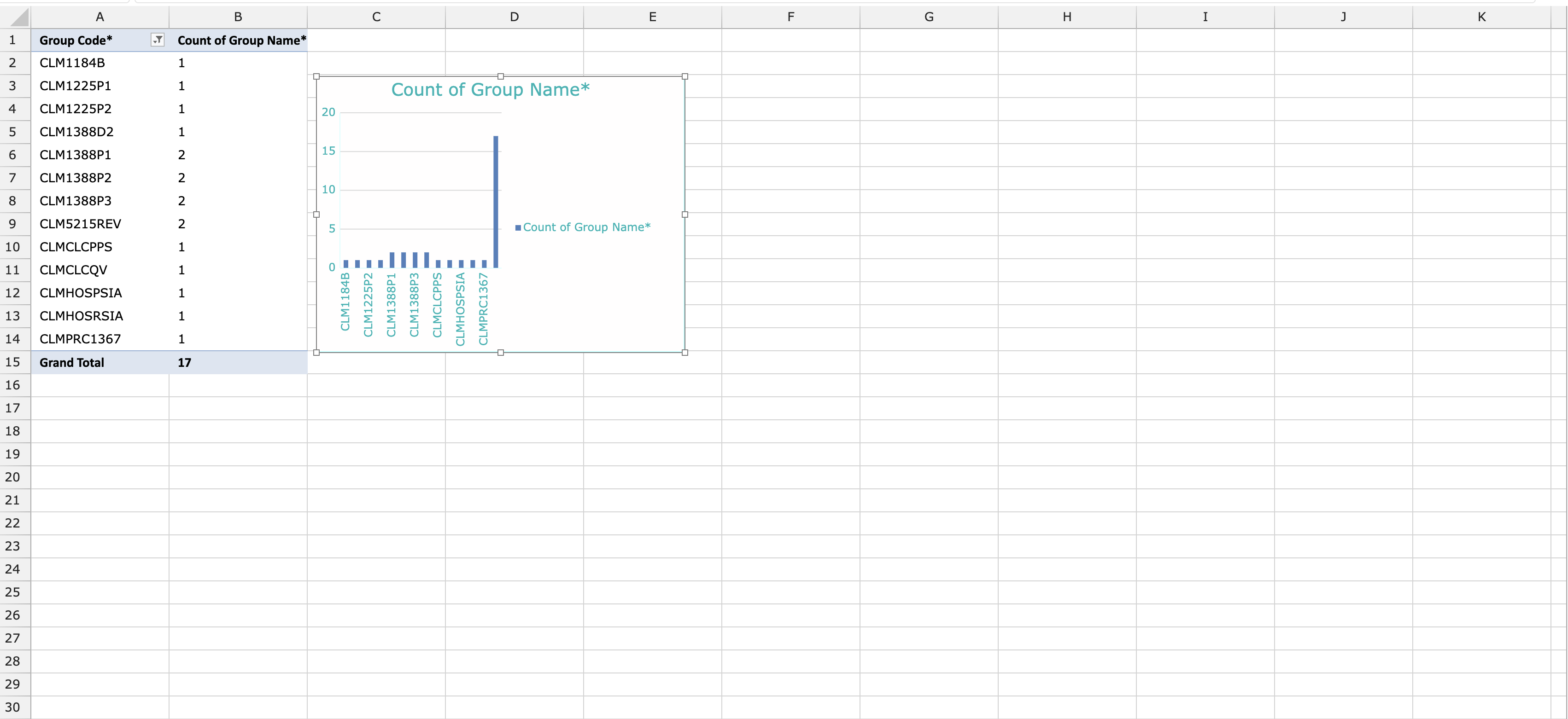
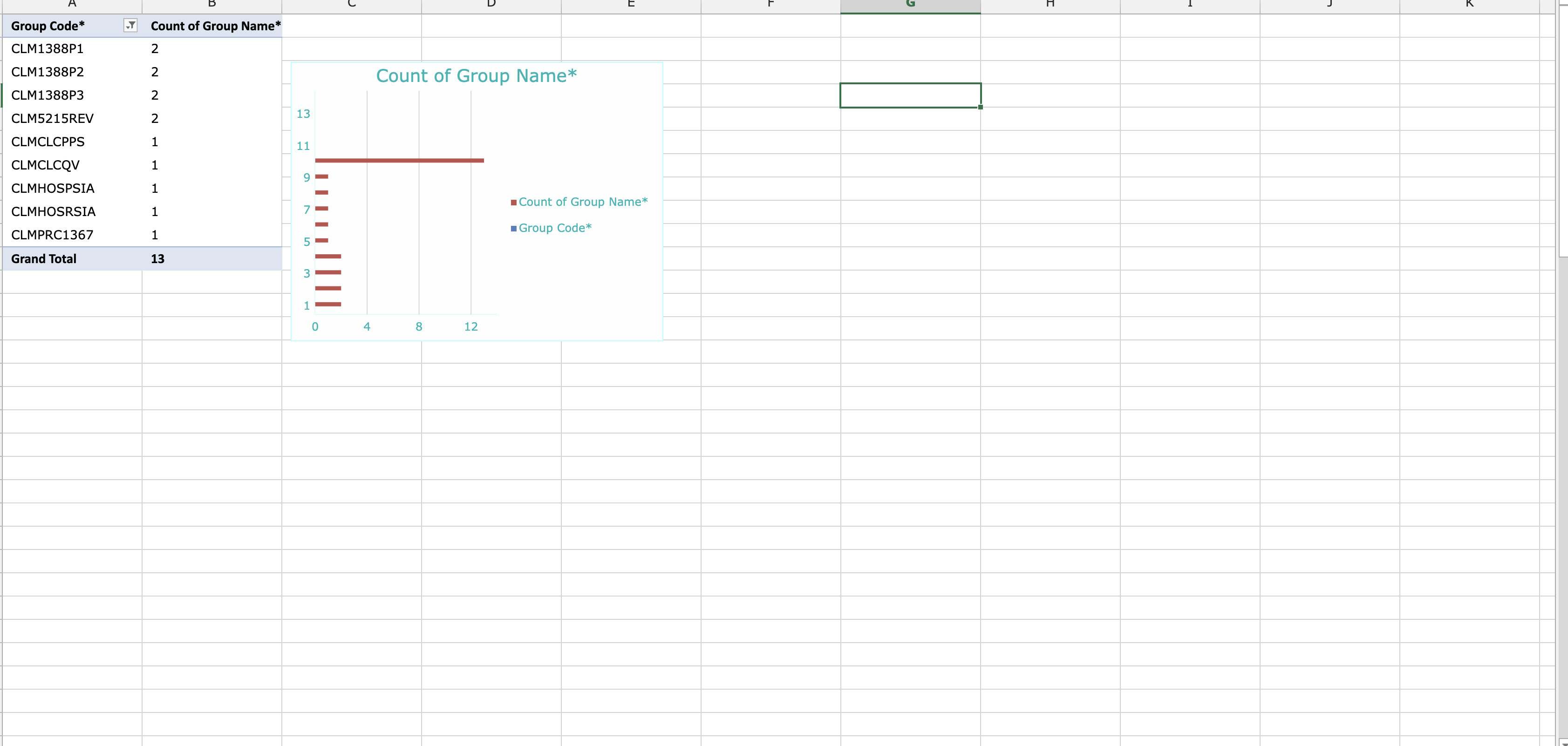
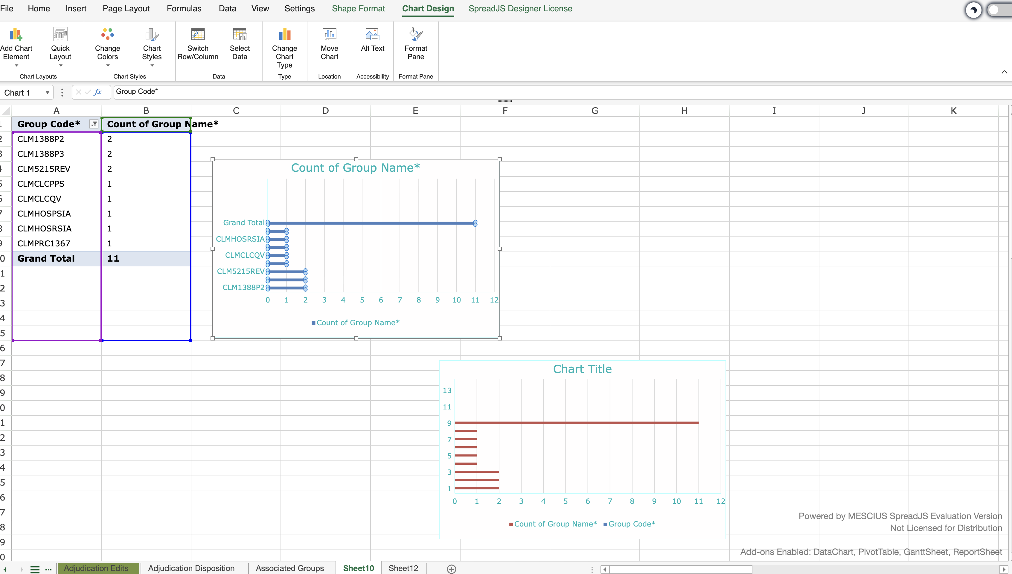
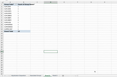
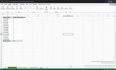
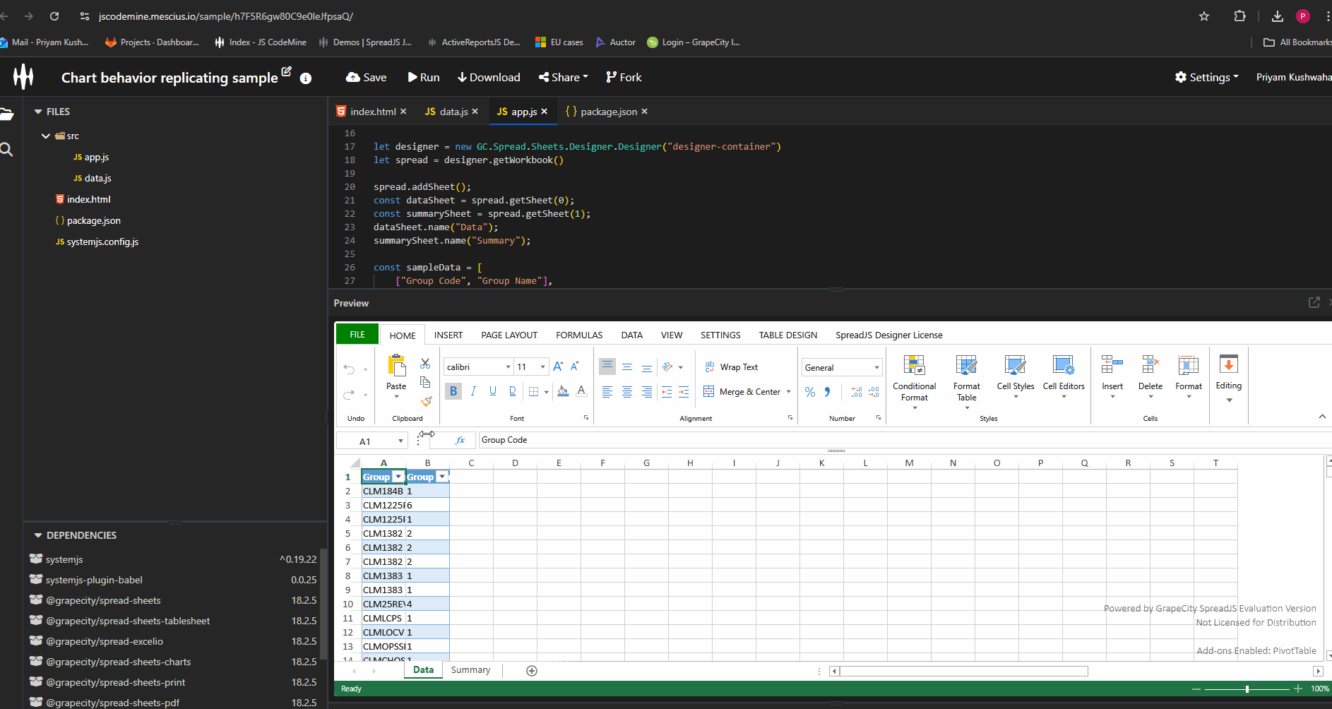
    I am trying to implement this behaviour .Suppose we have created a pivot table, and now we create a chart using pivot table and then perform some filter operation on pivot table and uncheck some of rows ( which results into making some of the cells empty in selected range empty ).And now we try to change the chart type using the chart options.Then the expected behaviour is axes horizontal values don’t need to change .(as happening in spreadJS) .

    But in my case , what is happening it switches to using numerical values instead of using the existing values for naming .(attached a screen recording). And this is the same behaviour when we simply try to create a chart using values ( also having empty cells in the end , then spreadJS uses numerical values ).Attaching screenshots for your reference.

    So how you are implementing this ?

  • Posted 27 November 2025, 6:00 am EST

    Hi,

    We tried to reproduce the behavior on our end but couldn’t replicate it. Could you please share a sample that demonstrates the issue, along with a video showing the steps and the problem? This will help us reproduce it accurately and investigate further.

    Additionally, please test the same scenario using the online SpreadJS Designer https://developer.mescius.com/spreadjs/designer/index.html

    If the issue does not occur there, it’s possible that you’re using an older version and the issue has already been resolved in the latest release (v18.2.5).

    Regards,

    Priyam

  • Posted 30 November 2025, 10:09 pm EST - Updated 30 November 2025, 10:14 pm EST

    I checked on spreadJS Designer , it is working as expected.


    I am trying to replicate this SpreadJS designer behaviour.

    Here , after applying filter (unchecking some rows) on pivotTable as we change the chart type , it is changing to numerical values .I am using spreadJS (18.2.3)

  • Posted 1 December 2025, 8:12 am EST

    Hi,

    We are still investigating the issue at our end. We will let you know about our findings as soon as possible.

    Regards,

    Priyam

  • Posted 2 December 2025, 4:55 am EST

    Hi,

    We attempted to reproduce the behavior based on the available information but couldn’t replicate it. To assist you better, could you please share a minimal working sample with the steps to reproduce the issue, or update the existing sample to reflect the behavior? This will help me investigate the problem more effectively.

    Sample: https://jscodemine.mescius.io/share/i6izTKGuQECM_zVgsJfYgw/?IsEmbed=false&Theme=Unset&PreviewDirection=0&IsEditorShow=true&IsExplorerShow=true&IsPreviewShow=true&IsConsoleShow=true&IsRunBTNShow=false&IsResetBTNShow=false&IsOpenInCodemineBTNShow=false&PanelWidth=20&PanelWidth=50&PanelWidth=30&defaultOpen={"OpenedFileName"%3A["%2Findex.html"%2C"%2Fpackage.json"%2C"%2Fsrc%2Fapp.js"]%2C"ActiveFile"%3A"%2Fsrc%2Fapp.js"}

    Regards,

    Priyam

  • Posted 2 December 2025, 5:32 am EST - Updated 2 December 2025, 5:37 am EST

    Hi,

    This issue is not reproduceable at spreadJS designer .Everything working as expected.

    Just need some help with this that how spreadJS is implementing this as trying to replicate this:

    Steps:

    1. Create a chart from pivot table. ( e.g. suppose with selected range Sheet1!:A1:B15)

      2.Now filter and uncheck some of rows ( e.g. say unchecked 3 items here) from pivot table.{ which results into leaving three empty cells here at the bottom as the selected range remains same (Sheet1!A1:B15) and filter hides some of rows}

      3.Now change the chart type. (chart gets updated properly in spreadJS designer as expected). Chart type gets changed as expected With proper labels , axes labels etc.

    2. Now , separately select the the same selected range ( i.e Sheet1!A1:B15 ).And now create a new chart from selected .See the difference , now chart gets created with numerical values at primary horizontal instead of first row names(i.e group codes in our sample).

    So , I just wanted to know , when changing the chart type after creating the chart from pivot table and applying filter ( as it have some empty cells now after filter ) then at that time how spread is handling these empty cells while updating chart type , so that it uses proper axes labels. Bcz if we normally create chart from same selected range ( containing empty cells at bottom) , then it gets created with numerical values at axes.

  • Posted 3 December 2025, 5:55 am EST - Updated 3 December 2025, 6:00 am EST

    Hi,

    We could reproduce the behavior by applying filters in the pivot table and then creating a chart where both axes contain numeric values. Please refer to the attached GIF.

    GIF:

    We are unsure why this is happening, so we have escalated it to the development team. The internal tracking ID is “SJS-32697”. We will update you as soon as we receive further information.

    Regards,

    Priyam

  • Posted 4 December 2025, 2:10 am EST

    Hi,

    The dev team has confirmed that Pivot Charts are not currently supported in SpreadJS, which is why this issue occurs. Pivot Chart support is already in the product backlog under the internal tracking ID SJS-9372. There is no ETA available yet, but we will update you as soon as we receive any information.

    Regards,

    Priyam

Need extra support?

Upgrade your support plan and get personal unlimited phone support with our customer engagement team

Learn More

Forum Channels