Is it possible to extend line and graph points past 250 limit?

Posted by: georgeg on 25 April 2025, 11:19 am EST

    • Post Options:
    • Link

    Posted 25 April 2025, 11:19 am EST

    Need to know if it is possible to extend the number of points in graph on the SpreadJS/Designer past 250 ? Apparently there is a limit of 250 points? There is a similar limitation in Excel apparently and they have some suggested workarounds… I am no expert in this aspect of Excel so I just need to basically know how to deal with large datasets and charts and graphs?

  • Posted 28 April 2025, 5:41 am EST - Updated 28 April 2025, 5:47 am EST

    Hi,

    Thank you for reaching out. We have been reviewing your case, and based on our understanding, it seems you are attempting to add more than 250 data points to your chart. In SpreadJS, there is no predefined limit on the number of data points in charts.

    However, it is important to note that Excel itself imposes certain internal limits on the number of data points in specific chart types, particularly in older versions. Newer versions of Excel allow for significantly more data points.

    In contrast, SpreadJS does not restrict the number of data points by default. That being said, for certain chart types, such as pie, doughnut, radar, and possibly surface charts, including a large number of data points may result in performance issues, such as freezing or memory problems.

    Currently, SpreadJS behavior aligns with the latest charting specifications and limitations in Microsoft Excel 365. For your reference, the relevant documentation can be found here: [\Excel Specifications and Limits - Microsoft Support : https://support.microsoft.com/en-us/office/excel-specifications-and-limits-1672b34d-7043-467e-8e27-269d656771c3.

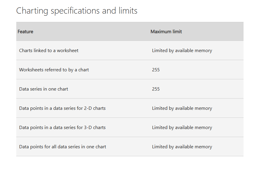
    Please see the attached image below for a summary of the latest charting specifications:

    For your convenience, we have also created a sample demonstrating the plotting of more than 250 data points in both a Pie chart and a Line chart. You can find the sample in the attached ZIP file. If this does not meet your requirements or if you have further use case details to share, please do not hesitate to let us know. We would be happy to assist you further.

    Refer to the attached sample : Sample.zip

    Best regards,

  • Posted 28 April 2025, 9:08 am EST

    Is there a way to improve performance for charts, cause it is so bad, even for 200 points, not to mention 800 (like in your sample).

    Looks like it is so bad for treemap, line chart with 200 points seems ok.

    For treemap with 200 points it took 40 seconds to render, i am actually don’t understand why it is so bad. Can you help with this performance issues?

  • Posted 29 April 2025, 7:26 am EST

    Hi,

    Thank you for your observation. You are absolutely right—rendering Treemap charts can be resource-intensive, particularly when dealing with large datasets. During our internal evaluation, we also noted a noticeable lag in rendering performance, even within Excel itself, for similar use cases.

    As you correctly pointed out, chart rendering performance can vary significantly based on the chart type. For instance, Line charts handle 200 data points quite efficiently, whereas Treemap charts experience performance degradation due to their inherently complex layout and rendering logic.

    We have escalated this concern to our development team for further investigation and performance profiling. Please be assured that this has been registered under our internal tracking system with ID: SJS-29570. We will provide updates as soon as we receive further insights or potential optimizations from the dev team.

    Thank you for your continued feedback and patience.

    Best regards,

Need extra support?

Upgrade your support plan and get personal unlimited phone support with our customer engagement team

Learn More

Forum Channels