Posted 3 July 2025, 3:34 am EST
- Updated 3 July 2025, 3:42 am EST
Hi Team,
Thank you for your previous response and the sample implementation using hierarchicalFilterUtility.ts. The solution helped resolve the issue where the “Apply” button was disabled despite a value being present in the filter input, and where filtering sometimes returned no results even though matching values existed.
However, I’m facing a new challenge with how the filter behaves for hierarchical data:
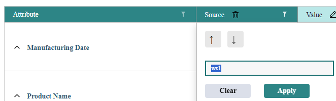
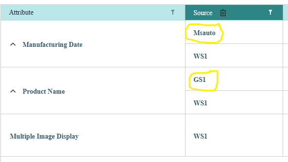
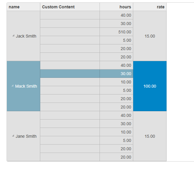
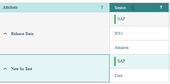
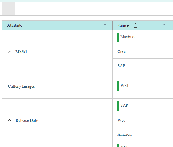
When I enter a specific value (e.g., WS1) in the filter input, the grid displays entire rows that contain WS1 in any child row. This includes parent rows with other child rows that have different values (e.g., GS1, Msauto). I would like the filter to show only the rows (parent and child) where WS1 is present, and exclude rows where the value is not found in any child.
In other words:
If WS1 is present in a child row, only that child row (and its parent if necessary) should be visible.
Rows with other values like GS1 or Msauto should not be shown if they don’t match the filter input.
Could you please guide me on how to modify the sample or the filtering logic to achieve this behavior?
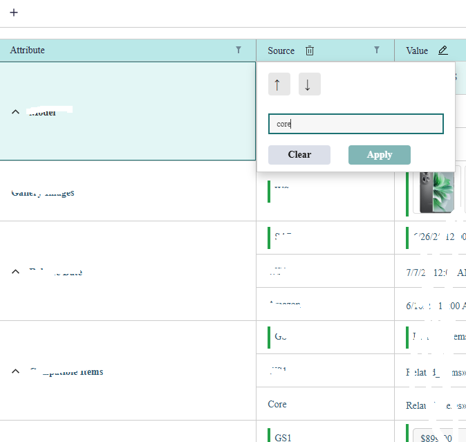
I’ve attached a screenshot for reference showing the current behavior.
Looking forward to your guidance.
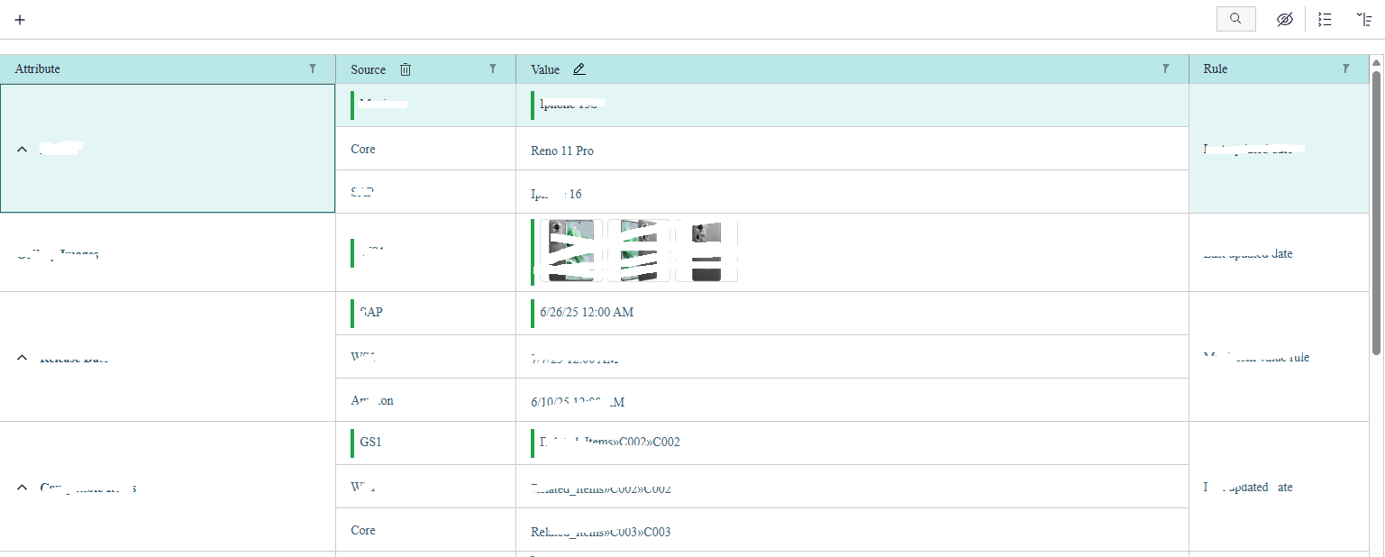
please find the below code
HTML
  <wj-flex-grid #flexGrid
                    [itemsSource]="gridData"
                    (initialized)="initGrid(flexGrid)"
                    headersVisibility="Column"
                    [selectionMode]="'Row'"
                    [stickyHeaders]="true"
                    [allowMerging]="'All'"
                    [childItemsPath]="['sources']"
                    >
TS
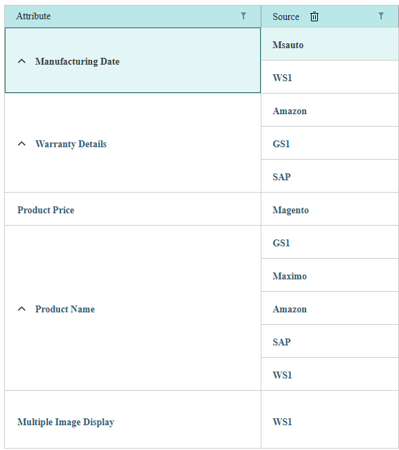
this.gridData = [
  {
    _id: 0,
    attribute: 'Manufacturing Date',
    sourceName: 'Msauto',
    displayAttributeName: 'Manufacturing Date',
    sources: [
      {
        _id: 1,
        attribute: 'Manufacturing Date',
        sourceName: 'WS1',
        isValidSource: true,
        displayAttributeName: 'Manufacturing Date'
      }
    ]
  },
  {
    _id: 2,
    attribute: 'Warranty Details',
    sourceName: 'Amazon',
    valueAttrPath: 'Titan_Cspec/Warranty Details_Impl/Sources#0/Value',
    isValidSource: true,
    displayAttributeName: 'Warranty Details',
    sources: [
      {
        _id: 3,
        sourceName: 'GS1',
        isValidSource: true,
        displayAttributeName: 'Warranty Details'
      },
      {
        "_id": 4,
        sourceName: 'SAP',
        isValidSource: true,
        displayAttributeName: 'Warranty Details'
      }
    ]
  },
  {
    _id: 5,
    attribute: 'Product Price',
    sourceName: 'Magento',
    isValidSource: true,
    displayAttributeName: 'Product Price',
    sources: []
  },
  {
    _id: 6,
    sourceName: 'GS1',
    isValidSource: true,
    displayAttributeName: 'Product Name',
    sources: [
      {
        "_id": 7 ,
        sourceName: 'Maximo',
        isValidSource: true,
        displayAttributeName: 'Product Name'
      },
      {
        _id: 8,
        attribute: 'Product Name',
        sourceName: 'Amazon',
        displayAttributeName: 'Product Name'
      },
      {
        _id: 9,
        sourceName: 'SAP',
        isValidSource: true,
        displayAttributeName: 'Product Name'
      },
      {
        _id: 10,
        attribute: 'Product Name',
        sourceName: 'WS1',
        isValidSource: true,
        displayAttributeName: 'Product Name'
      }
    ]
  },
  {
    _id: 11,
    attribute: 'Multiple Image Display',
    sourceName: 'WS1',
    displayAttributeName: 'Multiple Image Display',
    sources: []
  },
  {
    _id: 12,
    attribute: 'Colour',
    sourceName: 'SAP'
  }
];


