Issues with <wj-flex-pie> Chart – Size Adjustment & Label Truncation

Posted by: nilesh_nichal on 10 July 2025, 10:40 am EST

  • Posted 10 July 2025, 10:40 am EST - Updated 10 July 2025, 10:52 am EST

    Hi Team,

    I’m encountering two issues with the chart in my Angular application and would appreciate your guidance along with a sample StackBlitz if possible.

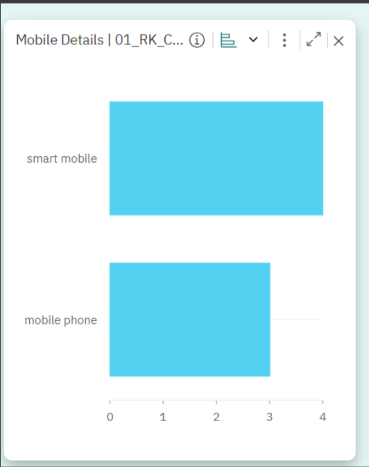
    Issue 1: Chart Size Appears Oversized

    The chart automatically adjusts its height and width, which results in an unbalanced and oversized appearance. I’d like to set a fixed size to make it more visually compact and aligned with the layout.

    HTML

    <wj-flex-pie 
      [itemsSource]="data" 
      [palette]="palette" 
      [binding]="'count'" 
      [bindingName]="'value'"
      [tooltipContent]="tooltip" 
      [startAngle]="200">
      <wj-flex-pie-data-label [position]="'Outside'" [content]="labelContent"></wj-flex-pie-data-label>
      <wj-flex-chart-legend [position]="'None'"></wj-flex-chart-legend>
    </wj-flex-pie>

    And the TypeScript model

    public data: ChartData[];
    export class ChartData {
      @serializable(primitive()) public value: string;
      @serializable(primitive()) public count: number;
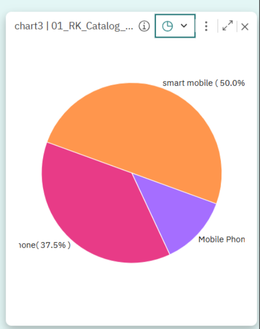
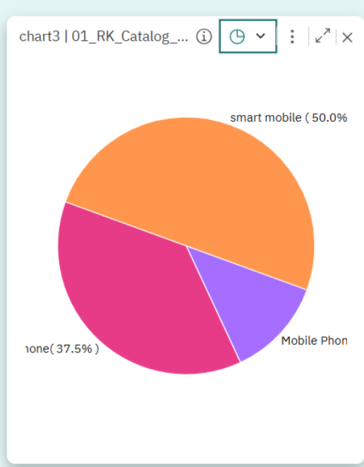
    }

    Issue 2: Label Truncation

    In the chart, one of the labels (“mobile phone”) is being truncated — the first letter “m” is missing, as shown in the attached screenshot. This affects readability and presentation.

    Request

    Could you please help with:

    1. How to set fixed dimensions (height and width) for the pie chart?
    2. How to ensure labels are fully visible and not truncated?

      A working Stack Blitz example demonstrating both solutions would be extremely helpful.

    Attached below screenshot for the reference

  • Posted 11 July 2025, 4:50 am EST

    Hi Nilesh,

    You can set the height/width/max-height/max-width properties of the ‘wj-flexchart’ or ‘wj-flexpie’ classes in your CSS file to control the height and width of the Flexcharts as per your needs. Please refer to the sample below demonstrating the same.

    For the data label cut-off issue, you can try changing the position of the data labels in the chart. If you want to use the same position, then you can also set the ‘plotMargin’ property to add a little margin around the chart. You can adjust the margin as per your needs. Please refer to the following sample for the same - https://stackblitz.com/edit/angular-oyfhpgab?file=src%2Fapp%2Fapp.component.html

    API reference - https://developer.mescius.com/wijmo/api/classes/wijmo_chart.flexpie.html#plotmargin

    In case, you still face any issues, please modify the above sample to replicate your issue and share it with us, so that we can have a better understanding of your project implementation and provide a solution accordingly.

    Regards

  • Posted 29 July 2025, 3:02 am EST - Updated 29 July 2025, 3:07 am EST

    Hi Team,

    Please provide the solution for

    Issue 2: Label Truncation

    In the chart, one of the labels (“mobile phone”) is being truncated — the first letter “m” is missing, as shown in the attached screenshot. This affects readability and presentation.

  • Posted 29 July 2025, 8:35 am EST

    Hi Nilesh,

    It seems there has been some misunderstanding, we have already provided a solution for this issue in our previous comment, i.e.,

    For the data label cut-off issue, you can try changing the position of the data labels in the chart. If you want to use the same position, then you can also set the ‘plotMargin’ property to add a little margin around the chart. You can adjust the margin as per your needs. Please refer to the following sample for the same - https://stackblitz.com/edit/angular-oyfhpgab?file=src%2Fapp%2Fapp.component.html

    API reference - https://developer.mescius.com/wijmo/api/classes/wijmo_chart.flexpie.html#plotmargin


    Please try the above approach to resolve this issue, if not already tried. In case you face any issues with the above solution, please let us know.

    Regards

  • Posted 30 July 2025, 6:22 am EST

    Hi Team,

    Thank you for your response and for sharing the sample and API reference.

    However, I’d like to clarify that the solution provided using the plotMargin property does not fully address our requirement. While it does prevent the data labels from being cut off, it also affects the overall chart layout — specifically, it reduces the size of the pie chart itself, as seen in your StackBlitz example. Removing the plotMargin increases not just the visibility of the labels but also the chart size, which is not desirable in our case.

    What we are looking for is the following behavior:

    Maintain the current size of the pie chart.

    Ensure data labels are either truncated, wrapped, or styled using CSS so they remain visible without altering the chart size.

    Could you please advise if there’s a way to achieve this — perhaps through CSS styling, label formatting options, or any other chart configuration — that allows label visibility without impacting the chart dimensions?

  • Posted 30 July 2025, 8:54 am EST

    Hi Nilesh,

    We are preparing a sample to wrap the text within the available space, if possible. We will share an update soon.

    Regards

  • Posted 31 July 2025, 5:40 am EST

    Hi Nilesh,

    You can handle the ‘rendered’ event of the chart manually, and wrap the label according to the available space. Here’s a sample for your reference demonstrating the same - https://stackblitz.com/edit/angular-mnmtc4wh?file=src%2Fapp%2Fapp.component.ts

    Please note that, if any single word in the label is very long, then it may still appear half cut, as wrapping would not break that word; you’ll need to slightly adjust the length using plotMargin in that case, in combination with text wrapping.

    Regards

  • Posted 1 August 2025, 3:12 am EST - Updated 1 August 2025, 3:17 am EST

    Hi Team,

    Thank you for the prompt and helpful solution regarding the data label cut-off issue in the pie chart. The approach using the rendered event and text wrapping was exactly what we needed, especially given the urgency and priority of the task — much appreciated!

    We now have a similar requirement for a bar chart, where the data labels are getting cut off due to length, as shown in the attached screenshot. In this case, the label is partially visible (“ltimate Version of the Celebrated Su-27 Platform”), and we’d like to ensure the full label is either wrapped, truncated, or styled appropriately — without affecting the chart layout or bar size.

    Could you please guide us on how to achieve similar behavior in a bar chart as you did for the pie chart?

    Looking forward to your support.

    Please find the attached screenshot for the reference

  • Posted 1 August 2025, 8:18 am EST

    Hi Nilesh,

    You can handle the ‘rendered’ event of the chart and make the necessary changes in the bar chart labels also. Please refer to the following sample demonstrating the same - https://stackblitz.com/edit/angular-ivy-bqfh4phr?file=src%2Fapp%2Fapp.component.ts

    Please note that we have used a slightly different approach for wrapping the labels here; you’ll have to insert the ‘\n’ character between the label text where you want to add a line break, as shown in the above sample. You may also need to make a little adjustment using the plotMargin depending on the label text length.

    Regards

Need extra support?

Upgrade your support plan and get personal unlimited phone support with our customer engagement team

Learn More

Forum Channels