Log axis minor ticks

Posted by: benoit.laplante on 17 June 2024, 3:27 pm EST

    • Post Options:
    • Link

    Posted 17 June 2024, 3:27 pm EST

    Hi, I would to display minor ticks on log axis

    From the log axis demo: https://developer.mescius.com/wijmo/demos/Chart/LineArea/LogarithmicAxis/angular

    I changed the angular axisX element to:

    <wj-flex-chart-axis [wjProperty]=“‘axisX’” [logBase]=“10” minorTickMarks=“Inside” >

    with no effect when there is space to display 5 minor ticks between 1 and 10. It seams the default behavior is not to show any, but I also tried many different configuration of minorUnit with no success.

    How to display 5 minor ticks with current demo dataset ?

  • Posted 19 June 2024, 1:47 am EST

    Hi Benoit

    The observed behavior is by design. When using the logBase property of AxisX in a chart, minor tick marks will not appear due to the nature of logarithmic scaling. In a logarithmic scale, the intervals between tick marks are exponential rather than uniform. For example, with a log base of 10, tick marks are at 1, 10, 100, etc., leading to non-uniform spacing.

    Minor tick marks are generally placed at regular intervals between major ticks. On a linear scale, this is straightforward as the intervals are evenly spaced. However, on a logarithmic scale, the intervals grow exponentially, complicating the placement of minor ticks and potentially causing them to not render.

    Regards

  • Posted 20 June 2024, 12:02 pm EST - Updated 20 June 2024, 12:07 pm EST

    Hi Sonu,

    After discussing with our clients, they argue minor ticks or gridlines are important in log scale to see where the point sit on the scale. I agree, it is a complicate thing to calculate when the domain is not known in advance and the chart can be resized. This is the reason we want a chart lib to calculate this for us. Also, wijmo chart auto log major tick placement are quite far apart compared to linear scale, there is space to add minor ticks.

    I asking for a feature request to support of auto minor ticks and gridline for log axis. I attached an image of excel charts using auto minor tick and gridline using the same data set as wijmo log axis example. I also attached an image of wijmo charts showing how far apart he major labels on log scale versus linear scale.


  • Posted 21 June 2024, 8:19 am EST

    Hi,

    I appreciate your understanding, I have escalated your enhancement requirements to our development team for review with an internal tracking ID WJM-34192. I’ll update you on this as soon as I hear back from them.

    Regards

  • Posted 9 September 2024, 1:28 pm EST

    Hi, did the development team had the chance to review internal track ID WJM-34192?

  • Posted 10 September 2024, 12:41 am EST

    Hi Benoit,

    The development team has reviewed your request and has decided to consider it as an improvement. It has been added to the “To Do” list, with a tentative release scheduled for the last week of December this year. Rest assured, we will keep you updated as soon as there is any development related to this case. Thank you for your patience.

    Regards,

  • Posted 3 January 2025, 7:41 am EST

    Hi Benoit,

    The enhancements have been added to the Wijmo FlexChart. You can verify it in the following demo sample - https://developer.mescius.com/wijmo/demos/Chart/LineArea/LogarithmicAxis/angular

    Regards

  • Posted 6 January 2025, 10:22 am EST

    Great! I’m looking forward integrating this into our products.

  • Posted 6 January 2025, 2:37 pm EST - Updated 6 January 2025, 2:43 pm EST

    A follow up, after testing the log minor ticks, I found one minor issue when skipping labels and one major issue when axis labelMin or labelMax is enabled.

    When configuring logBase=10 majorThickmarks=Outside and minorThickmarks=Inside and auto majorUnit and minorUnit it works well when enough space to display all majorTick at every base 10. See picture1

    When skipping a major tick because not enough space, there are too much minor ticks generated. In picture2, 4 minor ticks are displayed between 0.1 and 1 as expected, but more than the expected 8 minor ticks between 1 and 100 are displayed. See picture2.

    When labelMin or labelMax are enabled, in most case, all generated minor ticks are squished above labelMax as one large tick. See picture 3.

  • Posted 7 January 2025, 8:13 am EST

    Hi Benoit,

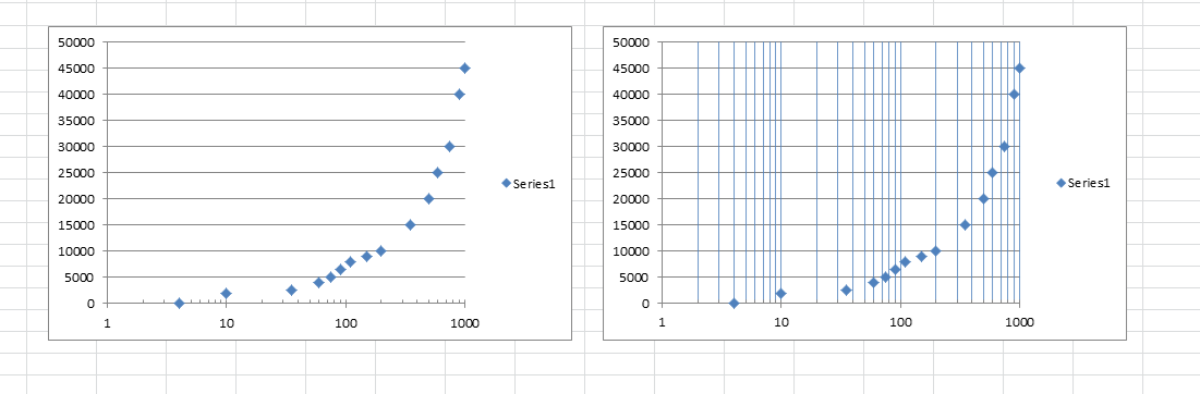
    After investigating the first issue we found that this is the expected behavior for now. This happens because minor ticks are calculated based on the ‘minorUnit’ value and a new minorUnit value is calculated with an algorithm for each range of major ticks on the axis. For example, we get the following results for minorTicks -

    (2, 3, 4, 5, 6, 7, 8, 9), (20, 30, 40, 50, 60, 70, 80, 90), (200, 300, 400, 500, 600, 700, 800, 900) when minorUnit = 1 and majorTickMarks are - [1,10,100,1000]

    But when in any case, a majorTick label is skipped, lets say 10, then in that case the first range will be 1-100 instead of 1-10, which results in 98 minor ticks to be rendered between 1-100 as minorUnit is 1. In this case, we would like to know about your opinion, that what would be the expected results, how many minorTicks should be rendered for 1-100 and 100-1000, when visible majorTick ranges are - [1,100,1000]. It will help us enhance the algorithm to produce better results.

    Regarding the second issue that occurs after setting the ‘labelMin’ and ‘labelMax’ properties to true, we have forwarded this issue to the engineering team for further investigation, as this behavior is not as expected. For now, you can use the following workaround to avoid this issue -

    // Workaround
    (wjChart as any).Axis.prototype._addMinMaxLabels = function (t: any, e: any) {
        if (this.labelMin) {
            var i = this.actualMin;
            if (isFinite(i) && t.indexOf(i) == -1) {
                e.splice(0, 0, this._formatValue(i));
                t.splice(0, 0, i);
            }
        }
        if (this.labelMax) {
            var r = this.actualMax;
            if (isFinite(r) && t.indexOf(r) == -1) {
                e.splice(0, 0, this._formatValue(r));
                t.splice(0, 0, r);
            }
        }
    };
    //

    Please find attached a workaround sample demonstrating the same. The exact same issue was not replicated on our end as visible in the screenshot you shared, so in case, if the issue still persists after applying the workaround, please share a small sample in which the issue can be replicated, so that we can investigate the issue further and assist you accordingly. You can also modify the attached sample to replicate the issue and share it with us.

    Regards

    workaround_sample.zip

  • Posted 7 January 2025, 3:49 pm EST - Updated 7 January 2025, 3:54 pm EST

    Replying to “In this case, we would like to know about your opinion, that what would be the expected results, how many minorTicks should be rendered for 1-100 and 100-1000, when visible majorTick ranges are - [1,100,1000]. It will help us enhance the algorithm to produce better results.”

    In my opinion and the product owner agree, it should be visually consistent. (You should confirm with a graphical designer). The number of ticks(major or minor, linear or log) and label generation should be generated in a consistant way based on available space . For majorTicks, when overlappingLabels=Auto, I would evenly distribute the labels and still show a major tick if not enough space for label to respect calculated or fixed majorUnit.

    In my previous post, picture1 minor and major ticks are consistently generated and labels are evenly distributed (at every tick). In picture2, I would show all major ticks (0.1,1,10,100,1000,10000) and maybe generate 3 minor ticks instead of 4 between major tick to be more visually appalling when less space. For labels, to be honest, you are way too strict on label generation for log scale axis. there is enough space to show all labels in picture2.

    I included a a linear scale example where labels should be evenly distributed at every 50 unit. The majorUnit seam to be auto calculated to 25 and, in my opinion, is too crowded but if forced to 25 I would show a majorTick at every 25 and show a label at every 2 tick if overlapping is not allowed.

    A graphical designer is better suited than me to know what is appealing to the eye. It is an interesting and challenging problem that unfortunately I don’t have an good enough expertise. I wish you do.

  • Posted 8 January 2025, 8:02 am EST

    Hi Benoit,

    Thank you for sharing the information. We have forwarded it to our engineering team. The new internal tracking IDs for the cases are - WJM-35506, WJM-35513

    We will update you when we have an update from the engineering team.

    Regards

Need extra support?

Upgrade your support plan and get personal unlimited phone support with our customer engagement team

Learn More

Forum Channels