
Posted 15 December 2020, 7:51 am EST - Updated 3 October 2022, 3:00 pm EST
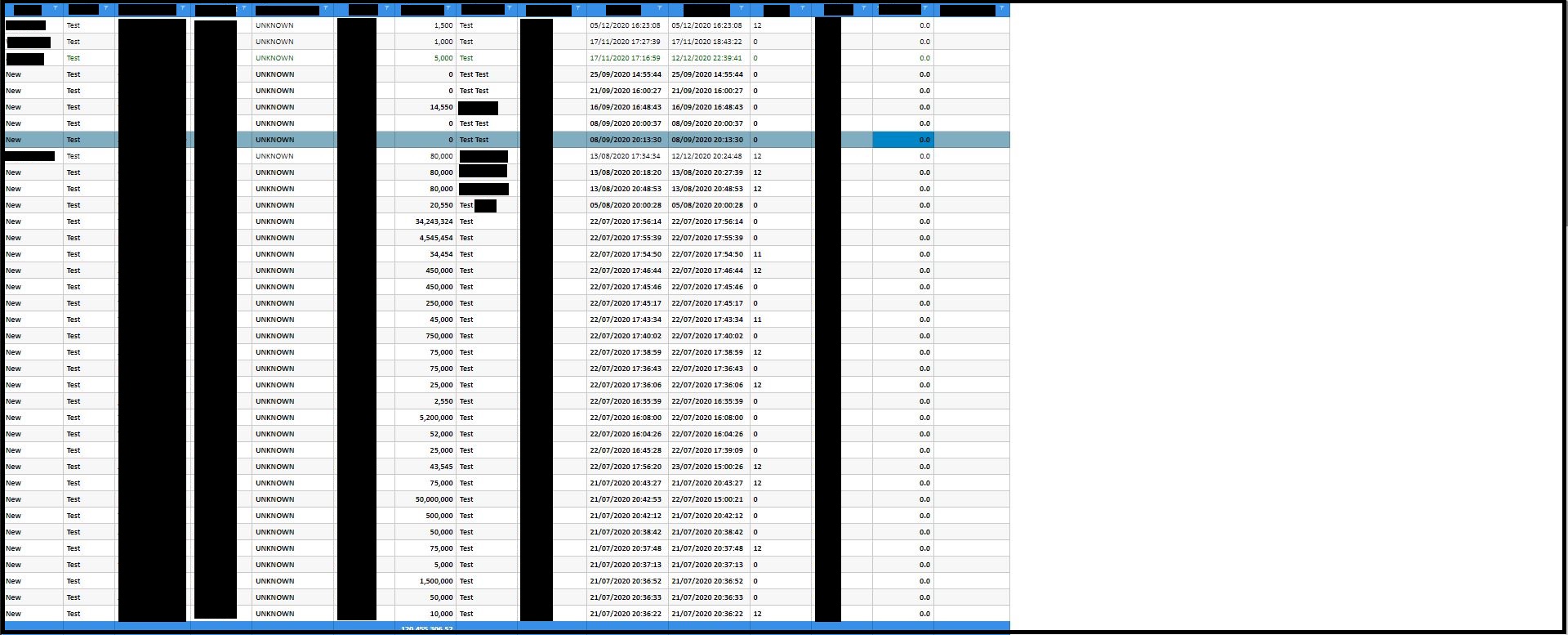
I have a grid that has multiple columns (the total number of columns depends on which columns the user has selected to show up).
For instance , minimum of 5 and max of 30 columns r in my grid.
The grid is working fine. a horizontal scroll bar appears if the “total column width” exceeds the width of grid (the grid width is set on responsive vw so it expands according to the screen size)
Now the Problem:
With scroll option
On high res screens, the width of grid is way more than the total width of columns. Thus, on the right-hand side (after the last displayed column), the entire grid shows white space (as there are no more columns to be displayed)
without scroll option
If I set * on columns, then all selected columns are displayed without a horizontal scroll. Which seems fine on high res screens. But on a low res screen, alll the columns shrink tight and the content is not readable at all.
Is there a way to add some calc function or something that makes the grid check the “Total width of selected columns” against the “total screen width” and then shows up with a scroller, or stretches the selected columns across the screen,
I am sorry in advance if i failed to communicate my problm,
In short, rephrasing my problem =
I want my grid (that has multiple columns) be able to be displayed on all screen sizes WITHOUT having to look like squeezed up (on low res screen) OR have a huge empty white space on the right side (on high res screen)
Thanks in Advance!


