
Posted 20 August 2020, 10:34 am EST - Updated 3 October 2022, 3:42 pm EST
Hello Team GrapeCity,
we have requirement to make bar in Hover state when mouse come over & Active state when click on it.
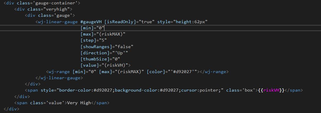
Please suggest how to achieve following to different requirement in wj-linear-gauge bar in Angular.
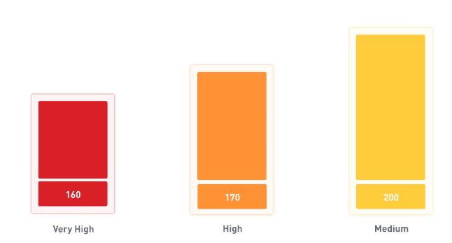
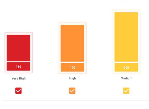
#1 Bars - Hove/click: on this state, background shadow/outlinecolor layer will appear on bar.
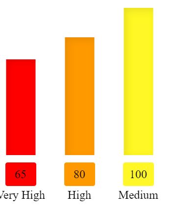
See the attache image of without hover & with hover for more clarity.
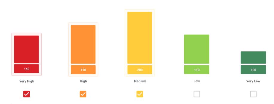
#2 Bars- Active state: On this state, background shadow/outline color layer will appear on bar when user click on the check box.
See the attache image of without hover & with hover for more clarity.
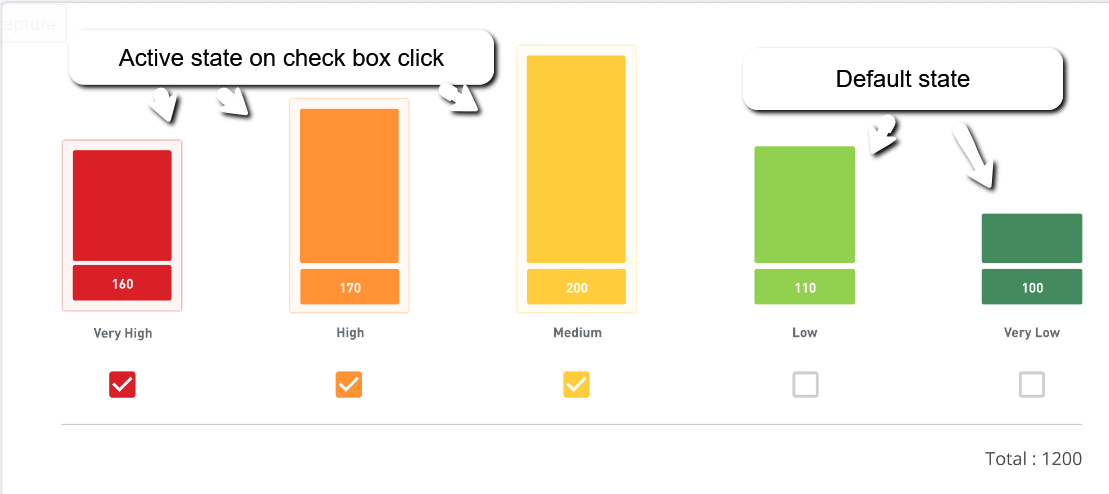
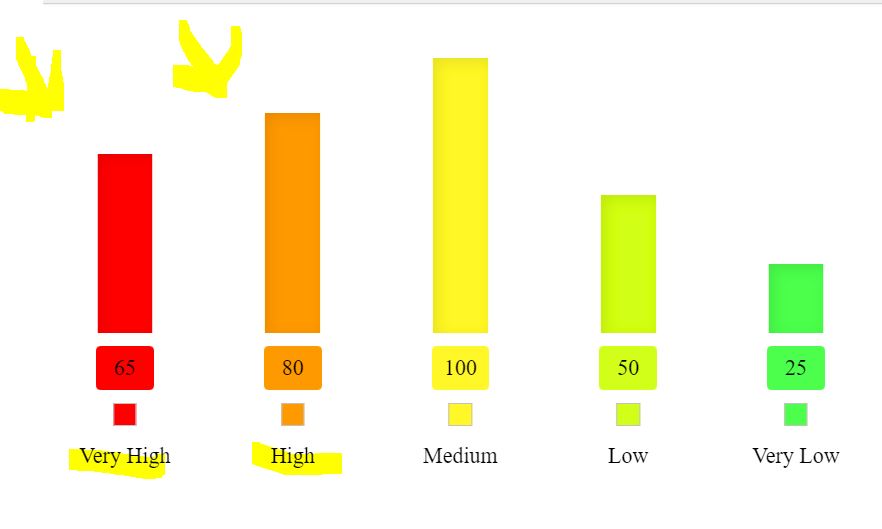
#3 Need this check box also in bottom of every bar.
Please suggest best possible solution and way .
Thanks in advance.


