Posted 27 August 2018, 7:53 pm EST - Updated 4 October 2022, 2:16 am EST
Hi,
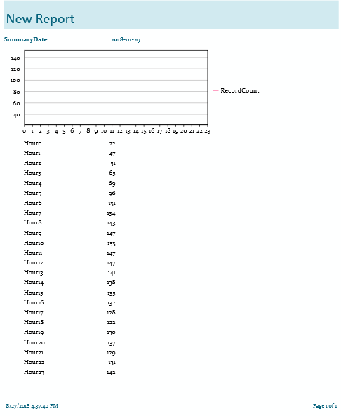
I am trying to create a report using the FlexDesigner App. Everything works OK except for the Chart at the top of my report (see picture attached). The data is shown correctly in the text below, and the chart itself seems to recognize the data because the X and Y axes are labeled correctly. The Y axis is auto-scaled and the marking on it agree with the range of data provided.
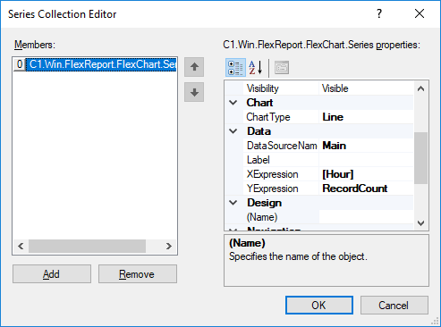
The X-axis labels comes from an expression (=Mid([Hour],5) to display only the numerical digits after ‘Hour’. I have also attached a picture of the chart dataseries properties for you to look at.
I made sure the color of the line was set to Black.
Is there anything else I need to do to get the actual line to paint?
Thank you for your assistance.
Charlie