Differences between FlexChart and C1Chart

Posted by: andrea.davoli on 19 October 2022, 6:52 am EST

    • Post Options:
    • Link

    Posted 19 October 2022, 6:52 am EST - Updated 19 October 2022, 6:57 am EST

    Hello there,

    I’m looking to change some chart from C1Chart to FlexChart.

    I’m cheking the documentation but I don’t find two things:

    1. How to put a label in a specific coordinate of the chart (even only for information), not tied to the data.
    2. How to insert an Alarm Zone in the chart

    I give you an image of a C1Chart in my software that I’d like to change in a FlexChart.

    David

    Thank you for you support!

    David

  • Posted 20 October 2022, 3:16 am EST - Updated 20 October 2022, 6:38 am EST

    Hi,

    Thanks for the snapshot.

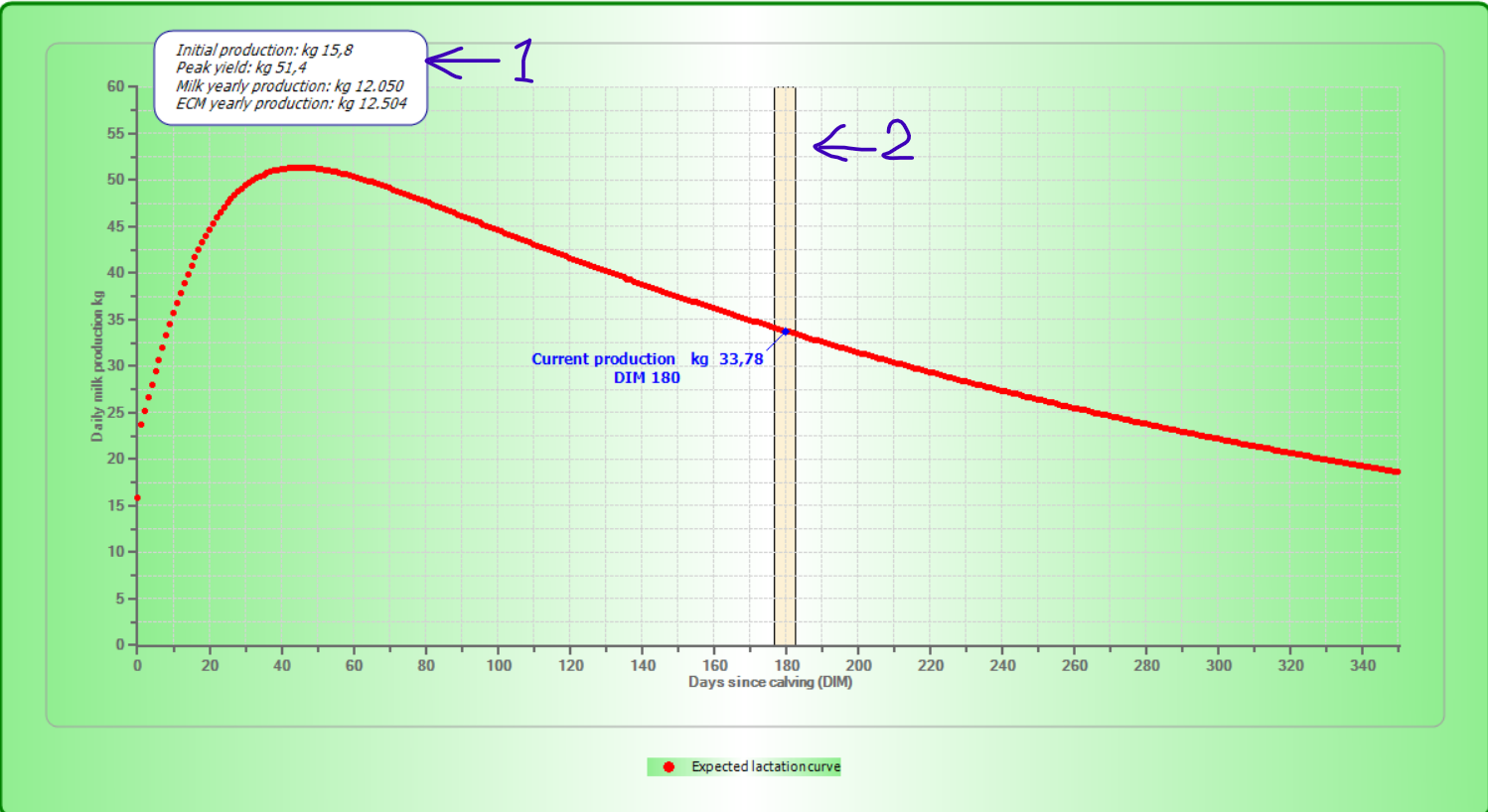
    1. To achieve this requirement you can draw annotations on FlexChart as:
            private void DrawAnnotation()
            {
                C1.Win.Chart.Annotation.AnnotationLayer annotationLayer = new C1.Win.Chart.Annotation.AnnotationLayer(flexChart);
                C1.Win.Chart.Annotation.Rectangle rect = new C1.Win.Chart.Annotation.Rectangle() { Location = new PointF(130, 60) };           
                rect.Height = 70;
                rect.Width = 180;
                rect.Style.Fill = Brushes.White;
                rect.Style.Stroke = Brushes.Blue;
                rect.Content = "Initial production: Kg 15,8\n" +
                    "Peak yield: Kg 51,4\n" +
                    "Milk yearly production: Kg 12.050\n" +
                    "ECM yearly production: Kg 12.504";
                annotationLayer.Annotations.Add(rect);
            }

    You can refer other Annotations from https://www.grapecity.com/componentone/docs/win/online-flexchart/annotation.html.

    1. We apologize to inform you that AlarmZone feature is not available in FlexChart. However, you can draw zones by handling FlexChart’s Rendering event as:
           private void FlexChart_Rendering(object sender, RenderEventArgs e)
            {
                var chartMax = ((IAxis)flexChart.AxisY).GetMax();
                var chartMin = ((IAxis)flexChart.AxisY).GetMin();
                e.Engine.SetFill(Brushes.Orange);
                e.Engine.SetStroke(Brushes.Black);
                foreach(var zone in zones)
                {
                    var x =flexChart.AxisX.Convert(zone.Min);
                    var y = flexChart.AxisY.Convert(((IAxis)flexChart.AxisY).GetMax());
                    var width = flexChart.AxisX.Convert(zone.Max) - flexChart.AxisX.Convert(zone.Min);
                    var height = Math.Abs(flexChart.AxisY.Convert(chartMax)- flexChart.AxisY.Convert(chartMin));
                    e.Engine.DrawRect(x,y,width,height);
                }
            }

    Please refer the attached sample for the same: FlexChart_Label_AlarmZone.zip

    Best Regards,

    Nitin

  • Posted 21 October 2022, 6:26 am EST

    Hi,

    thank you very much for the support, it was very helpful!

    Another question, as you can see in the image I posted, there is a blue point with his label. In the FlexChart I use a datatable, so how can I add only a point over the other lines?

    Thank you!

    David

  • Posted 23 October 2022, 11:57 am EST

    Hi,

    Thanks for your acknowledgment.

    You can achieve this requirement by handling Rendered event to show a point over a chart.(see code snippet)

           private void FlexChart_Rendered(object sender, RenderEventArgs e)
            {
                //Draw Point
                var x1 = flexChart.AxisX.Convert(180);
                var y1 = flexChart.AxisY.Convert(33.78);
                e.Engine.SetStroke(Brushes.Blue);
                e.Engine.SetFill(Brushes.Blue);
                e.Engine.DrawEllipse(x1, y1, 3, 3);
            }

    Please refer the attached modified sample for the same : FlexChart_Label_AlarmZone_Mod.zip

    Best Regards,

    Nitin

  • Posted 25 October 2022, 7:02 am EST

    Thank you again Nitin, so helpful!

  • Posted 2 November 2022, 7:25 am EST - Updated 2 November 2022, 7:33 am EST

    Hello, I need your help again.

    As you can see here there are a bar chart and then there is also a red line that have a different X and Y (Y2).

    It is possibile to replicate to the FlexChart?

    Another thing, how is possible to colour only a bar (like the green one in the image)?

    Thank you in advance!

    David

  • Posted 3 November 2022, 12:11 am EST

    Hi,

    Thanks for providing the snapshot.

    1. You can achieve this by adding multiple series into FlexChart. In your case, you need to add two series, i.e., 1. Column(Blue Bars) and 2.Spline(Red line).
               var series1 = new Series();
                series1.Binding = "Y1";
                series1.SymbolRendering += Series_SymbolRendering;
                series1.DataLabel = new DataLabel() { Content = "{value}",Position=LabelPosition.Top };
                flexChart.Series.Add(series1);
    
                var series2 = new Series();
                series2.Binding = "Y2";
                series2.ChartType = C1.Chart.ChartType.Spline;
                series2.Style.Stroke = Brushes.Red;
                series2.Style.StrokeWidth = 3;
                flexChart.Series.Add(series2);
    1. To change the color of a specific bar of a particular series on basis of a condition. You need to handle SymbolRendering event of the series as:(see code snippet)
           private void Series_SymbolRendering(object sender, RenderSymbolEventArgs e)
            {
                if((e.Item as DataItem).Y1 == 2.94)
                {
                    e.Engine.SetFill(Brushes.LightGreen);
                }
            }

    Please refer the attached sample : FlexChartDemo.zip

    Best Regards,

    Nitin

  • Posted 3 November 2022, 9:33 am EST

    Hello, thank you again for the fast and clear reply!

    I think I didn’t explain well the problem.

    I use the example I showed you:

    My bar chart use an array of 12 items, but the line is an array of 293 points.

    So they can’t “stay” in the same datatable.

    With the C1Chart I can use ChartGroups(0) and ChartGroups(1)

    Thank you,

    David.

  • Posted 4 November 2022, 12:52 am EST

    Hi David,

    Apologize for the misunderstanding.

    If you have two collections i.e., ** 1. **with 12 items and 2. with 293 items. And wants to display two sereis for particular collection.

    Then you can additionally set DataSource for the 2nd Series. (See code snippet)

                var series2 = new Series();
                series2.Binding = "Y";
                series2.ChartType = C1.Chart.ChartType.Line;
                series2.Style.Stroke = Brushes.Red;
                series2.Style.StrokeWidth = 3;
                series2.AxisX = new Axis();
                series2.AxisX.Max = 295;
                series2.DataSource = data2;
                flexChart.Series.Add(series2);

    Please refer the attached sample : FlexChartDemo_Mod.zip

    Best Regards,

    Nitin

Need extra support?

Upgrade your support plan and get personal unlimited phone support with our customer engagement team

Learn More

Forum Channels