
- Introduction
- Report Readers
- Report Authors
- DevOps
-
Developers
- Quick Start
- Breaking Changes
- ActiveReports Version Compatibility and Migration
- License ActiveReports
- Configure ActiveReports Using Code
- Work with Reports using Code
- Report Parts
- Create Designer and Viewer Applications
- Extensibility in ActiveReports
- External Customizations in ActiveReports
- Export Reports
- Print Reports
- Plugins Development
- Samples
- Troubleshooting
Toolbar
ActiveReports provides a toolbar integrated with the Visual Studio IDE for quick access to report designing commands. This toolbar is composed of buttons and dropdown lists which offer functions for a number of commonly used commands.
Show or Hide the Toolbar in Visual Studio
Create a new project or open an existing project in Visual Studio.
Right click on the Visual Studio toolbar and from the context menu that appears, select ActiveReports.
The ActiveReports toolbar appears under the Visual Studio menu bar. The toolbar options may differ based on whether you have a Section Report, Page Report or an RDLX Report open.
See the description of each toolbar option in the tables below.
type=note
Note: Toolbar descriptions are grouped in a logical order for understanding. The buttons and dropdowns may appear in a different order in the ActiveReports toolbar.
Text Decoration
Command | Description |
|---|---|
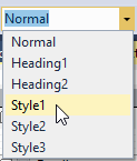
Style | Sets the style for the selected report control. For details on setting styles in Page and RDLX reports, see Working with Styles. For details on setting styles in Section Report, see Working with External Style Sheets. |
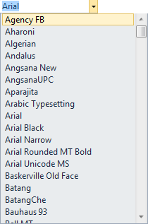
Font | Sets the typeface of all the text in a control. In a Section Report, for the RichTextBox control, typeface of only the selected text changes. In a Page Report or an RDLX Report, in a data region like Tablix or Table, you can change the typeface of the entire data region or only the selected TextBox within the region. |
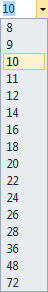
Font Size | Sets the font size of all the text in a control. In a Section Report, for the RichTextBox control, font size of only the selected text changes. In a Page Report or an RDLX Report, for a data region like Tablix or Table, you can change the font size of the entire data region or only the selected TextBox within the region. |
Fore Color | Opens a Choose Color dialog to set the text color of controls. |
Back Color | Opens a Choose Color dialog to set the background color of controls. |
Bold | Sets or removes text emphasis from the entire text of the control. In Section Report, for the RichTextBox control, bold applies to the selected text only. In a Page Report or an RDLX Report, for a data region like Tablix or Table, you can change the emphasis of the entire text or only the text of the selected TextBox within the region. |
Italic | Sets or removes text slant for the entire text of the control. In a Section Report, for the RichTextBox control, italic applies to the selected text only. In a Page Report or an RDLX Report, for a data region like Tablix or Table, you can italicize the entire text or only the text of the selected TextBox within the region. |
Underline | Sets or removes the text underline for the entire text of the control. In a Section Report, for the RichTextBox control, underline applies to the selected text only. In a Page Report or an RDLX Report, for a data region like Tablix or Table, you can also underline the entire text or only the text of the selected TextBox within the region. |


Text Alignment
Command | Description |
|---|---|
Align Left | Aligns the text to the left in the control area. |
Center | Aligns the text to the center in the control area. |
Align Right | Aligns the text to the right in the control area. |
Align Justify | Justifies the text in the control area. |


Layout Editing
Command | Description |
|---|---|
Zoom Out | Reduces the magnification level of the design surface and any elements within it. |
Zoom In | Increases the magnification level of the design surface and any elements within it. |
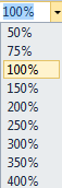
Zoom | Opens a dropdown list to set the magnification level of the design surface between 50% and 400%. Zoom percentage is set to 100% by default. |


Control Alignment
Command | Description |
|---|---|
Align to Grid | Snaps the top left of the selected control to the closest gridline. |
Align Lefts | Aligns the selected controls with their left border coinciding with the left border of the primary control. The vertical space separating the controls remains the same. |
Align Rights | Aligns the selected controls with their right border coinciding with the right border of the primary control. The vertical space separating the controls remains the same. |
Align Tops | Aligns the selected controls with their top border coinciding with the top border of the primary control. The horizontal space separating the controls remains the same. |
Align Middles | Aligns the selected controls vertically to the middle with respect to the primary control. The horizontal space separating the controls remains the same. |
Align Bottoms | Aligns the selected controls with their bottom border coinciding with bottom border of the primary control. The horizontal space separating the controls remains the same. |


Control Resizing
Command | Description |
|---|---|
Make Same Width | Resizes the width of the selected controls to the width of the primary control. |
Make Same Height | Resizes the height of the selected controls to the height of the primary control. |
Make Same Size | Resizes the size (width and height) of the selected controls to the size of the primary control. |
Size to Grid | Snaps the selected control to the closest gridline by resizing the control on all four sides. |


Control Spacing
Command | Description |
|---|---|
Make Horizontal Spacing Equal | Creates equal space between the selected controls with respect to the primary control, using the outermost edges of the controls as end points. |
Increase Horizontal Spacing | Increases the horizontal spacing by one grid unit with respect to the primary control. |
Decrease Horizontal Spacing | Decreases the horizontal spacing by one grid unit with respect to the primary control. |
Remove Horizontal Spacing | Removes the horizontal space so that the selected controls move to the nearest edge of the top-left control. |
Make Vertical Spacing Equal | Creates equal space between the selected controls with respect to the primary control, using the top and bottom edges of the control as the end points. |
Increase Vertical Spacing | Increases the vertical spacing by one grid unit with respect to the primary control. |
Decrease Vertical Spacing | Decreases the vertical spacing by one grid unit with respect to the primary control. |
Remove Vertical Spacing | Removes the vertical spacing so that the selected controls move to the nearest edge of the top-left control. |


Z-order Alignment
Command | Description |
|---|---|
Bring to Front | Moves the selected controls to the front of all other controls on the report. |
Send to Back | Moves the selected controls behind all other controls on the report. |


RichTextBox commands
Command | Description |
|---|---|
Bullets | Adds or removes bullets from the selected text inside a RichTextBox control in a Section Report. |
Increase Indent | Increases the indent of selected text in the RichTextBox control area in a Section Report. |
Decrease Indent | Decreases the indent of selected text in the RichTextBox control area in a Section Report. |


Others
Command | Description |
|---|---|
View ReportExplorer | Shows or hides the Report Explorer window. See Report Explorer for further details. |
Reorder Groups | Opens the Group Order dialog, where you can drag and drop groups to rearrange them. This button is enabled when you have multiple groups in a Section Report. |
Layer List | Opens the Layer List window to displays a list of Layers in the report along with their visibility and lock options. Layer List Explorer also allows you to add or remove Layers from your reports. See Layers for further details. |


type=note
Note: Primary control is the control in a selected group of controls, to which you align all other controls. It is generally the first control selected in the group and has sizing handles (white boxes) which are different from the rest of the selected controls.