
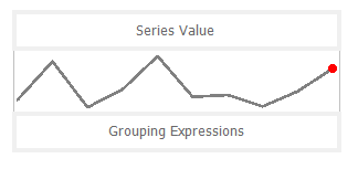
Sparkline
You can use the Sparkline report control as a simple means of displaying the trend of data in a small graph. The Sparkline displays the most recent value as the rightmost data point and compares it with earlier values on a scale, allowing you to view general changes in data over time. With the height similar to the surrounding text and the width not more than 14 letters wide, the sparkline fits well in dashboards, reports, and other documents.
Important Properties
By clicking on the Sparkline control, you can set its properties in the Properties panel.
| Property | Description |
|---|---|
| AccessibleDescription | Enter the alternative description of the control for use by accessibility client application. The property on exporting the report adds the ‘alternative text’ in PDF and ‘alt’ attribute in HTML. |
| DataSetName | Specify a dataset associated with the sparkline. |
| DataSetParameters | Specify a dataset parameter associated with the sparkline. |
| FillStyle | Choose the type of gradient for the sparkline from None, LeftRight, TopBottom, Center, DiagonalLeft, DiagonalRight, HorizontalCenter or VerticalCenter. You can also select a color to fill the sparkline from the color picker. |
| Filters | Add a new filter by specifying the Expression, Operator, and Value. |
| LineStyle | Enter a value to set the Width of the Line type sparkline. You can also choose the color of the line from the color picker. |
| Location | Enter a value in points to set the location of the sparkline. |
| MarkerColor | Select a color for the last point marker or select the Expression option to open the Expression Editor and create an expression that evaluates to a .NET color. |
| MarkerVisibility | Select whether to display a marker at the last point on the sparkline of Line type. |
| MaximumColumnWidth | Select the maximum width of columns in the sparkline. |
| Range | Select a value or enter an expression that defines the lower bound and upper bound of the wall range. By using the backdrop, you can choose the type of gradient and color of the wall range. |
| RangeVisibility | Select whether to display the range or not. |
| SeriesValue | Enter a series value of the sparkline. |
| Size | Enter the Width and Height of the sparkline. |
| SparklineType | Choose the sparkline type from Line, Columns, Whiskers, Area, or StackedBar. |
Sparkline Dialog Properties
You can set the Sparkline properties in the Sparkline dialog. To open it, with the Sparkline selected on the report, under the Properties panel, click the Property dialog link.
General
Name: Enter a name for the sparkline that is unique within the report. This name can be called in code. You can only use underscore (_) as a special character in the Name field. Other special characters such as period (.), space ( ), forward slash (/), back slash (\), exclamation (!), and hyphen (-) are not supported.
Tooltip: A textual label for the report item used to include TITLE or ALT attributes in HTML reports.
Dataset Name:
Data
Value: Enter an expression to use as the sparkline value.
Name: Enter a name for the sparkline that is unique within the report. This name can be called in code. A name is created automatically if you do not enter one.
Group on: Enter an expression to use for grouping the data. If you open the expression editor, you can select a field from the dataset.
Detail Grouping: Enter an expression to use if you do not want to repeat values within the details. If you open the expression editor, you can select a field from the dataset.
Parent Group: For use in recursive hierarchies. Enter an expression to use as the parent group.
Appearance
Sparkline Type: Choose from the following sparkline types. Each of these types has its own set of Appearance properties that appears when you select the type. See Types of Sparklines for more details.
- Line
- Columns
- Whiskers
- Area
- StackedBar
Visibility
Initial visibility
- Visible: The sparkline is visible when the report runs.
- Hidden: The sparkline is hidden when the report runs.
- Expression: Use an expression with a Boolean result to decide whether the sparkline is visible. True for hidden, False for visible.
Visibility can be toggled by another report item: Select this check box to display a toggle image next to another report item. This enables the drop-down box below where you can specify the TextBox control which, if clicked, toggles the visibility of the sparkline in the Viewer.
Navigation
Document map label: Enter an expression to use as a label to represent this item in the table of contents (document map).
Bookmark ID: Enter an expression to use as a locator for this sparkline. You will then be able to provide a bookmark link to this item from another report item using a Jump to bookmark action.
Filters
You need to provide three values to add a new filter to the collection: Expression, Operator, and Value.
Expression: Enter the expression to use for evaluating whether data should be included in the group.
Operator: Select from the following operators to decide how to compare the expression to the left with the value to the right.
- Equal Only choose data for which the value on the left is equal to the value on the right.
- Like Only choose data for which the value on the left is similar to the value on the right.
For more information on using the Like operator, see the MSDN Web site. - NotEqual Only choose data for which the value on the left is not equal to the value on the right.
- GreaterThan Only choose data for which the value on the left is greater than the value on the right.
- GreaterThanOrEqual Only choose data for which the value on the left is greater than or equal to the value on the right.
- LessThan Only choose data for which the value on the left is less than the value on the right.
- LessThanOrEqual Only choose data for which the value on the left is less than or equal to the value on the right.
- TopN Only choose items from the value on the left which are the top number specified in the value on the right.
- BottomN Only choose items from the value on the left which are the bottom number specified in the value on the right.
- TopPercent Only choose items from the value on the left which are the top percent specified in the value on the right.
- BottomPercent Only choose items from the value on the left which are the bottom percent specified in the value on the right.
- In Only choose items from the value on the left which are in the array of values specified on the right.
Selecting this operator enables the Values list at the bottom. - Between Only choose items from the value on the left which fall between the pair of values you specify on the right. Selecting this operator enables two Value boxes instead of one.
Value: Enter a value to compare with the expression on the left based on the selected operator. For multiple values used with the Between operator, the lower two value boxes are enabled.
Values: When you choose the In operator, you can enter as many values as you need in this list.
Sorting
Click the plus sign button to enter new sort expressions, and remove them using the X button.
Expression: Enter an expression by which to sort the data in the group.
Direction: Select Ascending or Descending for the selected sort expression.
Data Output
Element Name: Enter a name to be used in the XML output for this sparkline report control.
Output: Choose Auto, Yes, No, Contents Only to decide whether to include this Sparkline in the XML output. Choosing Auto exports the contents of the Sparkline report control.
Types of Sparklines
Line
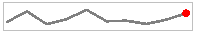
The Line sparkline is widely used in financial and economic data analysis and is based on a continuous flow of data. The currency exchange rates, price change are examples of the application of this type of sparklines.
Appearance Properties
| Property | Description |
|---|---|
| Last point marker is visible | Select to display a marker at the last point on the sparkline. |
| Marker Color | Select a color to use for the last point marker, or select the <Expression...> option to open the Expression Editor and create an expression that evaluates to a .NET color. |
| Line Style | |
| Color | Select a color to use for the line, or select the <Expression...> option to open the Expression Editor and create an expression that evaluates to a .NET color. |
| Width | Enter a value in points to set the width of the line. |
| Enable Wall Range | Select this check box to display a wall range for the sparkline. Selecting this box enables the rest of the properties in this section. |
| Lower Bound | Select a value or enter an expression that defines the lower bound of the wall range. |
| Upper Bound | Select a value or enter an expression that defines the upper bound of the wall range. |
| Wall Range Backdrop | |
| Fill Color | Select a color to use for the wall range, or select the <Expression...> option to open the Expression Editor and create an expression that evaluates to a .NET color. |
| Gradient | Choose the type of gradient to use for the backdrop: None, LeftRight, TopBottom, Center, DiagonalLeft, DiagonalRight, HorizontalCenter, or VerticalCenter. |
| Gradient End Color | Select a color to use for the end of the wall range gradient, or select the <Expression...> option to open the Expression Editor and create an expression that evaluates to a .NET color. |
Columns
The Column sparkline is used for sports scores, cash register receipts, and other cases where previous values and the current value do not closely influence one another. This sparkline is used when dealing with discrete data points, and not a continuous flow of data as in the Line sparkline.
Appearance Properties
| Property | Description |
|---|---|
| Fill Color | Select a color to use for the fill of the sparkline, or select the <Expression...> option to open the Expression Editor and create an expression that evaluates to a .NET color. |
| Maximum Column Width | Select the maximum width of columns in the sparkline. If blank, all columns are sized to fit. |
| Enable Wall Range | Select this check box to display a wall range for the sparkline. Selecting this box enables the rest of the properties in this section. |
| Lower Bound | Select a value or enter an expression that defines the lower bound of the wall range. |
| Upper Bound | Select a value or enter an expression that defines the upper bound of the wall range. |
| Wall Range Backdrop | |
| Fill Color | Select a color to use for the wall range, or select the <Expression...> option to open the Expression Editor and create an expression that evaluates to a .NET color. |
| Gradient | Choose the type of gradient from these choices: None, LeftRight, TopBottom, Center, DiagonalLeft, DiagonalRight, HorizontalCenter, or VerticalCenter. |
| Gradient End Color | Select a color to use for the end of the wall range gradient, or select the <Expression...> option to open the Expression Editor and create an expression that evaluates to a .NET color. |
Whiskers
The Whisker sparkline is typically used in win/loss/tie or true/false scenarios. This type is similar to the Column sparkline, but it renders a tie (0 value) in a different manner. The bars in a whisker sparkline render below the baseline for a negative value, above the baseline for a positive value, and on the baseline for a zero value, for example, in a profit/loss and no profit/no loss scenario.
Appearance Properties
| Property | Description |
|---|---|
| Fill Color | Select a color to use for the fill of the sparkline, or select the <Expression...> option to open the Expression Editor and create an expression that evaluates to a .NET color. |
| Maximum Column Width | Select the maximum width of columns in the sparkline. If blank, all columns are sized to fit. |
| Enable Wall Range | Select this check box to display a wall range for the sparkline. Selecting this box enables the rest of the properties in this section. |
| Lower Bound | Select a value or enter an expression that defines the lower bound of the wall range. |
| Upper Bound | Select a value or enter an expression that defines the upper bound of the wall range. |
| Wall Range Backdrop | |
| Fill Color | Select a color to use for the wall range, or select the <Expression...> option to open the Expression Editor and create an expression that evaluates to a .NET color. |
| Gradient | Choose the type of gradient from these choices: None, LeftRight, TopBottom, Center, DiagonalLeft, DiagonalRight, HorizontalCenter, or VerticalCenter. |
| Gradient End Color | Select a color to use for the end of the wall range gradient, or select the <Expression...> option to open the Expression Editor and create |
Area
The Area sparkline is similar to the Line sparkline but visually you see the space under the line as shaded.
Appearance Properties
| Property | Description |
|---|---|
| Fill Color | Select a color to use for the fill of the sparkline, or select the <Expression...> option to open the Expression Editor and create an expression that evaluates to a .NET color. |
| Enable Wall Range | Select this check box to display a wall range for the sparkline. Selecting this box enables the rest of the properties in this section. |
| Lower Bound | Select a value or enter an expression that defines the lower bound of the wall range. |
| Upper Bound | Select a value or enter an expression that defines the upper bound of the wall range. |
| Wall Range Backdrop | |
| Fill Color | Select a color to use for the wall range, or select the <Expression...> option to open the Expression Editor and create an expression that evaluates to a .NET color. |
| Gradient | Choose the type of gradient from these choices: None, LeftRight, TopBottom, Center, DiagonalLeft, DiagonalRight, HorizontalCenter, or VerticalCenter. |
| Gradient End Color | Select a color to use for the end of the wall range gradient, or select the <Expression...> option to open the Expression Editor and create an expression |
StackedBar
The Stacked Bar sparkline is presented as a horizontal bar with different segment lengths marked by distinct color hues. The Stacked bar illustrates how the various segments of a part-to-whole relationship correspond to one another - the largest segment represents the highest value and the change in brightness indicates a new value on a scale.
Appearance Properties
| Property | Description |
|---|---|
| Fill Color | Select a color to use for the fill of the sparkline, or select the <Expression...> option to open the Expression Editor and create an expression that evaluates to a .NET color. |