
Tablix
A Tablix data region displays data in cells that are arranged in rows and columns. It provides enhanced layout capabilities ranging from the creation of simple tables to advanced matrices. Tablix is essentially a combination of two data regions, the table, and the matrix. Therefore, it provides all the features of a table and a matrix along with added capabilities including support for multiple adjacent groups on rows or columns and improved layout flexibility with stepped group layouts.
By default, each tablix cell contains a TextBox control, and the function for each cell is determined by its location. You can change the layout of the Tablix data region using the LayoutDirection property.
Structure
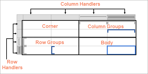
The Tablix data region is composed of four areas denoted by dotted lines on the design surface - the corner, the row group area, the column group area, and the body.
Corner
The Corner element is located in the upper-left corner, or upper-right corner if a tablix has the LayoutDirection property set to Rtl. The layout direction applies at preview time only. This area is automatically expanded horizontally or vertically when you add a new column or row groups. You can merge cells inside the tablix corner and insert a data visualizer such as a TextBox or Image.
A corner may contain only static cells that are rendered only once in Tablix.
Column Group
A Column group is represented by square brackets above the columns. Tablix column groups are located in the upper-right corner (upper-left corner for the Rtl layout). A column group represents a member of the column groups hierarchy and displays the column group instance values.
Row Group
A Row group is represented by square brackets on the left side of the rows. Tablix row groups are located on the lower-left corner (lower right for the Rtl layout). A row group represents a member of the row groups hierarchy and displays row group instance values.
Body
The Body element is used for displaying aggregated data with respect to row and column grouped data in the report. The body may contain only static cells that are rendered only once in Tablix.
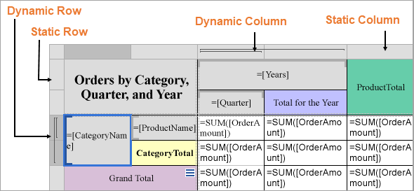
Static and Dynamic Rows and Columns
Rows or columns in the Tablix data region can be static or dynamic. The Tablix data region contains multiple rows and columns that provide a grid-type layout, where you can add or remove static or dynamic rows and columns in order to display your data efficiently.
Static Rows and Columns - A static row or column is not associated with any group data. When the report runs, a static row or column is rendered only once. Labels and totals are displayed using static rows or columns in the Tablix data region.
Dynamic Rows and Columns - A dynamic row or column is associated with one or more groups and renders once for every unique value in the group. You can also create dynamic group rows or columns by adding a row group or a column group.
Row and Column Handlers
When you select a Tablix data region, the row and the column handles appear. These handles help you to work with a Tablix and visually specify the type of data added in your tablix layout.
The following table shows the different types of handles that appear in a Tablix data region.
Handle Icon | Description |
|---|---|
| Row or column with one outer group. |
| One outer group and one inner group. |
| One outer group with an extra row for totals and one inner group. |


Tablix Layout Actions
The Tablix data region provides context menu options to perform basic layout actions. You can access layout options for Tablix rows from the context menu by right-clicking on a selected row.
Insert Row: Select from the following options to insert a row inside or outside of the selected group cell.
Inside Group: If a row group contains groups having distinct values, then as many rows are inserted as there are groups.
Above: Inserts a row above for each unique value of the row group.
Below: Inserts a row below for each unique value of the row group.
Outside Group: If a row group contains nested groups consisting of child and parent groups, then as many rows are inserted as there are parent groups.
Above: Inserts a row above for each unique value of the parent row group.
Below: Inserts a row below for each unique value of the parent row group.
Delete Row: Delete the selected rows.
Distribute Rows Evenly: Set the same height for multiple selected rows.
Add Row Group: Select from the following options to insert row groups in a tablix.
Parent Group: To insert a parent row group.
Child Group: To insert a child row group.
Adjacent Above: To insert an adjacent row group above the selected row group.
Adjacent Below: To insert an adjacent row group below the selected row group.
Row Group: Select the Delete Group option to delete a row group.
You can access layout options for Tablix columns from the context menu by right-clicking on a selected column.
Insert Column: Select from the following options to insert a column inside or outside of the selected group cell.
Inside Group: If a column group contains groups having distinct values, then as many columns are inserted as there are groups.
Left: Inserts a column to the left for each unique value of the column group.
Right: Inserts a column to the right for each unique value of the column group.
Outside Group: If a column group contains nested groups consisting of child and parent groups, then as many columns are inserted as there are parent groups.
Left: Inserts a column to the left for each unique value of the parent column group.
Right: Inserts a column to the right for each unique value of the parent column group.
Delete Column: Delete the selected columns.
Distribute Columns Evenly: Set the same width for multiple selected columns.
Add Column Group: Select from the following options to insert column groups in a tablix.
Parent Group: To insert a parent column group.
Child Group: To insert a child column group.
Adjacent Left: To insert an adjacent column group to the left of the selected column group.
Adjacent Right: To insert an adjacent column group to the right of the selected column group.
Column Group: Select the Delete Group option to delete a column group.
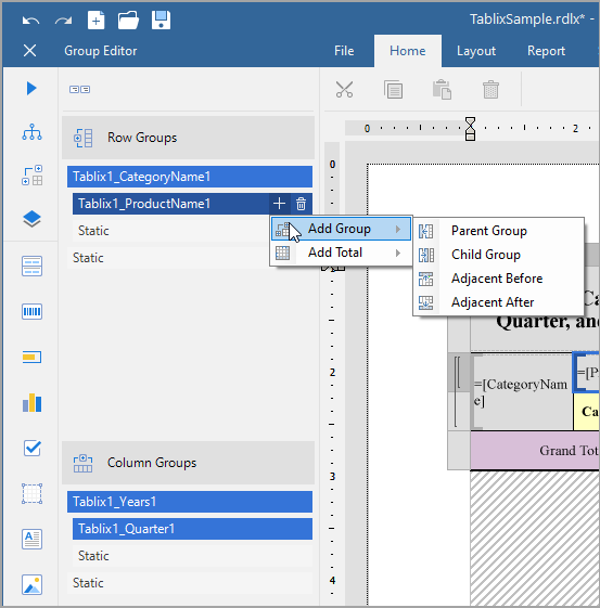
Group Editor
The Group Editor window gets displayed or hidden by the Group Editor icon, located on the left of the Design area. The Group Editor contains the following groups:
Row Groups: The Row Groups section in the Group Editor displays all the groups that are applied in the row group area of the Tablix data region.
Category Name
The left-center cell of the Tablix data region =[CategoryName] represents the Category group in the Group Editor window. This group displays the category names for products.
Product Name
The left-center cell of the Tablix data region =[ProductName] represents the Product group in the Group Editor window. This group displays the product names.
Column Groups: The Column Groups section in the Group Editor window displays all the groups that are applied in the column group area of the Tablix data region.
Year
The center-left cell of the Tablix data region =[Years] represents the Years group in the Group Editor window. This group displays years of orders.
Quarter
The center-right cell of the Tablix data region =[Quarter] represents the Quarter group in the Group Editor window. This group displays quarters for the orders.
Static Cells: Static cells in the Row Groups and Column Groups are not represented in the Group Editor window because these cells are not associated with any grouped data. Static row and column cells are used to display labels and totals in a Tablix data region.
The static column cell displays the label YEARS and CATEGORY NAMES in the Tablix data region. The static row cell displays the label Total in the Tablix data region.
The image below displays the subjects in a row group. Nested column groups display practical and theory scores for the students. The total row displays the total scores for all of the subjects.
Tablix Features
Column and Row Groups
Groups categorize the report data using a specified expression. You can add a group by using the context menu options or in the Group Editor component that is part of the designer.
In Tablix, you can add row/column groups in the following ways:
Parent-child groups: To depict the hierarchical relation.
Adjacent groups: To show the side-by-side grouping of report data.
Show / Hide Tablix Rows and Columns
You can use the Hidden property on Tablix member headers to conditionally hide entire rows or columns in a Tablix data region. When the expression evaluates to True, the corresponding member — including its group header and associated row or column — is not rendered in the report output.
This allows you to tailor the report layout dynamically based on parameters, filters, or user-defined logic.
Property:
HiddenType:
ExpressionInfoDefault: (Empty) – interpreted as
False
💡 Use this to simplify reports at runtime by showing only relevant rows or columns.
Guidelines:
All headers in the same row or column must use the same expression.
You can’t hide rows or columns that contain body cells.
Total rows or columns don’t support the
Hiddenproperty.
Important Group and Layout Properties for Tablix Groups
Filters: The filters to apply on the group.
GroupExpressions: Specifies the group expression for the group.
NewSection: Determines whether each group instance has its page numbering.
PageBreak: Indicates how the rendering engine inserts a page break in relation to the group.
BreakLocation: Determines the location of page breaks generated by group instances.
None: no page breaks are generated.
Start: each group instance inserts the page break before printing its content.
End: each group instance inserts the page break after printing its content.
StartAndEnd: the combination of the Start and End options.
Between: inserts a page break between each group instance. If the group has a parent group, the break is applied between each group instance within the same parent group value. If the group has no parent, the break is applied between all group instances across the dataset.
Disabled: Indicates whether the page break properties should be ignored. The expression allows you to conditionally prevent page breaks from being inserted by the aforementioned property.
NewPage: Indicates on which page the content to start after the page break.
Next: A default value that makes a new group start from the immediate next page of the report.
Odd: A new group starts from the next odd page of the report.
Even: A new group starts from the next even page of the report.
See Manage Page Breaks in Data Regions topic for more detail.
KeepTogether: Setting it True ensures that the group instance always appears on a single page if it fits.
To add a group
Select the Tablix data region in the design area.
Right-click and select any group action in the context menu that appears.
Or, with a Tablix selected, click Group Editor on the left of the Designer.
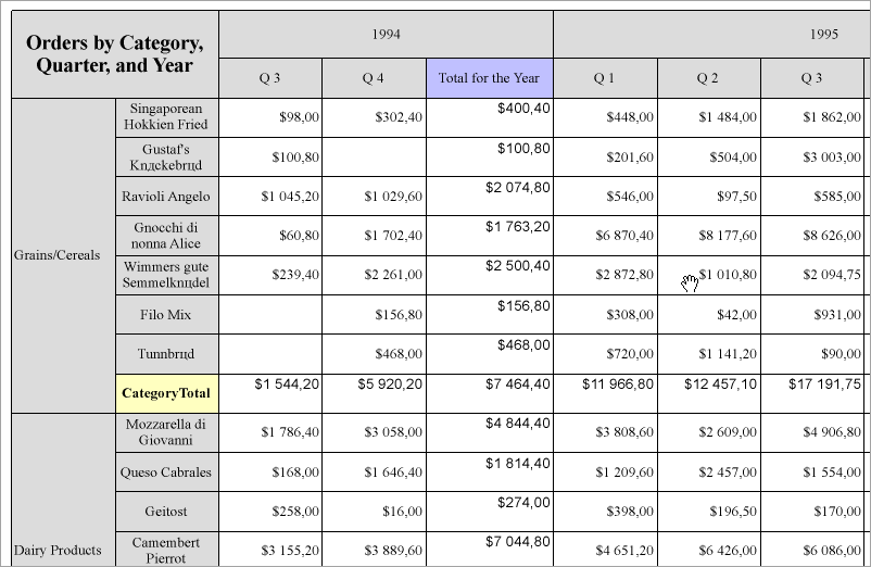
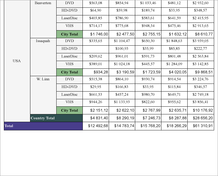
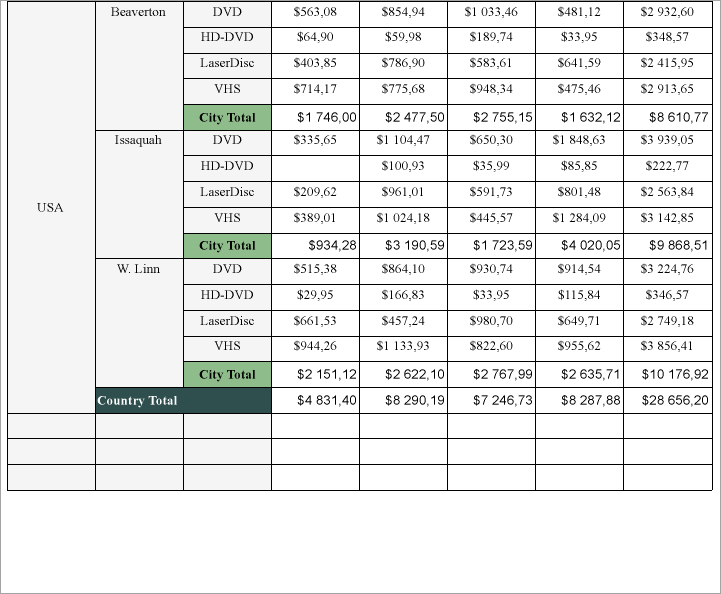
Totals
The intersection of a Row and Column Group displays one or more summary values. For example, in a report output, Row Groups may display media types, Column Groups - quarters, and their intersections may show the Sales for each media type in each quarter.
A tablix can display two types of totals.
The Grand Total appears at the beginning or at the end of all the group instances.
The Subtotal appears at the beginning or at the end of each group instance.
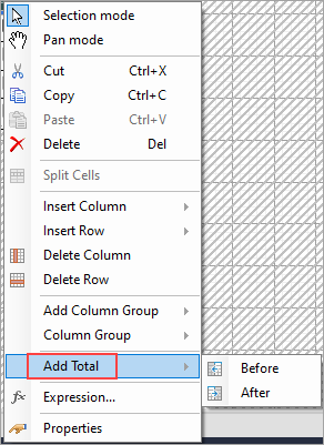
To add a total,
Right-click a Tablix cell and select Add Total > Before or Add Total > After menu item.
If a group does not have a parent, then the grand total will be inserted. Otherwise, the subtotal for the parent group will be created.
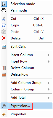
To insert additional totals, you can add rows and columns and set an expression to calculate sum for the newly added cells.
Merge Cells
Tablix cells with the same value in a row group or a column group area are automatically merged. In the case of static cells, you can combine adjacent cells in horizontal (same row) or vertical (same column) direction into a single cell. For example, you may want a column header to span across the columns.
To merge cells,
Select the cells (Ctrl+Click) and then right-click.
From the context menu, select Merge Cells.
Auto Merge
The AutoMergeMode property lets you set the mode to merge the adjacent cells (text boxes) in a row group with the same value. This property takes Always, Never, and Restricted values. The row groups with the same data values and with AutoMergeMode property set to:
Always - are merged.
Never - are not merged.
Restricted - are merged only if the corresponding cells in the previous columns are similarly merged. If for example, cells in Column 2 (with the same data values) are set 'Restricted' and the corresponding cells (with the same data values) in previous column, that is Column 1, are set 'Never', then cells in Column 2 are not merged.
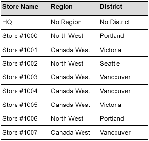
Let us take an example. In the following simple Tablix data region, 'District' column is Outside Group - Right to the 'Region' column group. We want the 'District' values to merge in case the 'Region' values are the same.
The tablix without AutoMergeMode set in any cell looks as follows:
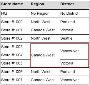
Let us set the AutoMergeMode property for the 'District' and the 'Region' values.
Select the cell with District field in the row group and set the Layout > AutoMergeMode property to 'Restricted'. This merges districts depending on whether the corresponding regions (cells in the previous column) are merged.
Select the cell with Region field in the row group and set the Layout > AutoMergeMode property to 'Always'. This merges the cells with similar regions.
Preview the report. Here's how the tablix will look like.
Repeat to Fill (Page report)
If you set the RepeatToFill property to True (the default value is False), the Tablix will fill extra space with empty rows.
Setting the RepeatToFill property to 'True' (default value is 'False') fills the tablix with empty rows to reach the Fixed Height of the tablix. So, each page of the report displays the tablix with the same height. For example, the following image shows the page of a report where RepeatToFill property for the Tablix data region is set to 'False':
Then, in the Properties panel, set the RepeatToFill property to 'True'. At the report preview, you will see that the tablix now has additional empty rows on the same page of the report.
Freeze Rows and Columns (RDLX Reports)
When you use a Tablix data region containing a large amount of data in an RDLX report, the user must scroll to see all of the data. On scrolling the column or row headers out of sight, the data becomes difficult to understand. To resolve this problem, you can use the FrozenRows and FrozenColumns properties that take effect in the JSViewer in Galley mode, and allow you to freeze headers so that they remain visible while scrolling through the data region. You can freeze as many rows or columns as you have headers in the data region.
If your data stretches downward, set the FrozenRows property to a value to float the column headers when scrolling.
If your data stretches to the right, set the FrozenColumns property to a value to float the row headers when scrolling.
If your data stretches both downward and to the right, set both FrozenRows and FrozenColumns properties.
Here's how a report with one frozen row and column headers looks like in JS Viewer.
If any header cells that you want to freeze are merged, you should not set the FrozenRows or FrozenColumns property to a value that would split a merged cell.
See Also
Show Row Number in Tablix and Table