
Contour Chart
The Contour Chart visualizes three-dimensional data on a two-dimensional plane by using contour lines and color-filled areas. It groups data into defined contour levels, which are each represented by distinct colors, allowing users to quickly understand data distribution and surface gradients.
The Contour Chart inherits all existing properties of the Heat Map control.
Contour chart allows users to define:
NumberOfLevels: Specifies the total number of contour levels to create by evenly dividing the data range
Levels: Specifies the contour levels individually as a numerical array. This gives you explicit control over where each contour line is drawn.
If both Levels and NumberOfLevels properties are present, NumberOfLevels takes precedence and the values in the Levels array will be ignored.
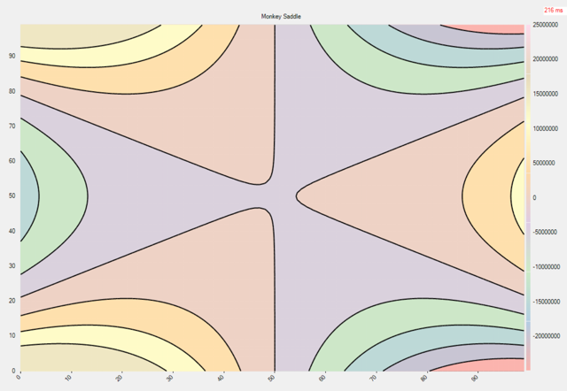
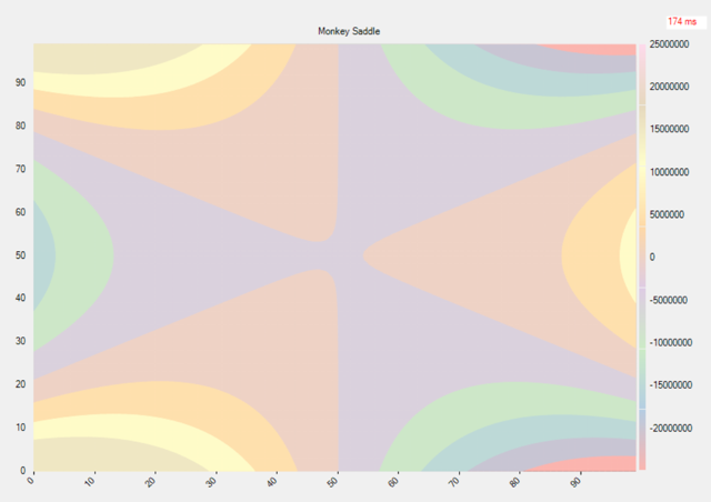
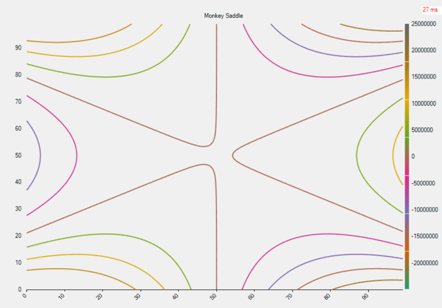
Appearance: FlexChart offers the contour chart in three forms:
LineArea: Combines contour lines and filled areas to show both value boundaries and gradients.
Area: Displays smooth color-filled regions to represent continuous data ranges.
LineArea: Shows only contour lines to emphasize value boundaries and shapes.
LineArea | Area | LineArea |
|---|---|---|
|
|
|
Sample Usage
The following code demonstrates how to initialize a Contour series, set the number of levels, and configure its appearance.
gradientScale = new GradientColorScale
{
    Min = data.Min,
    Max = data.Max,
    Colors = gradientColors,
    Axis = new ColorAxis { Position = Position.Right }
};

contour = new Contour
{
    ColorScale = gradientScale,
    DataSource = data.Values,
    NumberOfLevels = 8,
    Appearance = ContourAppearance.LineArea,
    // Levels = [1, 8, 10, 29, 100] // If both Levels and NumberOfLevels property are present, NumberOfLevels will take precendence.
};

this.flexChart1.Series.Add(contour);