
Custom Template
InputPanel provides the flexibility to create custom template to change the layout of the control according to user requirements. By creating a custom template, you can develop compact and visually-appealing forms that match your application. InputPanel provides DataTemplate to define a custom layout and change the way the control appears.
The following image shows a custom template applied to the InputPanel control.
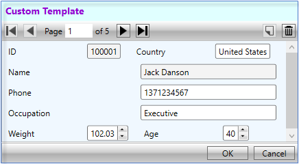
You can create a custom template using DataTemplate to change the layout of the control using the following steps. This example uses the sample created in Quick start. In this example, a data template is created that contains a StackPanel comprising two StackPanels with horizontal orientation. These two inner StackPanels consists horizontally-aligned editors while the outer StackPanel consists vertically-aligned editors. InputPanel accesses this data template through the ItemsSource property.
The example also showcases the customization of InputPanel header template using the HeaderTemplate property of the C1InputPanel class.
type=note
By default, all the editors in InputPanel are stacked vertically. To change the alignment of editors, set the AutoGenerate property to false.
Add the following code inside the <UserControl.Resources></UserControl.Resources> tags to create a custom data template with various editors stacked vertically and horizontally.
<UserControl.Resources>
    <DataTemplate x:Key="Template">
        <StackPanel Background="AliceBlue">
            <StackPanel Orientation="Horizontal">
                <c1:C1InputTextBox Header="ID" DataBinding="{Binding ID, Mode=OneWay}"
                     IsReadOnly="True" LabelForeground="{Binding LabelForeground,
                    ElementName=InPanel}">
                </c1:C1InputTextBox>
                <c1:C1InputTextBox Header="Country" DataBinding="{Binding Country,
                    Mode=TwoWay, UpdateSourceTrigger=PropertyChanged}"
                    IsReadOnly="{Binding IsReadOnly, ElementName=InPanel}"
                    LabelForeground="{Binding LabelForeground, ElementName=InPanel}">
                </c1:C1InputTextBox>
            </StackPanel>
            <c1:C1InputTextBox Header="Name" DataBinding="{Binding Name, Mode=OneWay}"
                    IsReadOnly="True" LabelForeground="{Binding LabelForeground,
                ElementName=InPanel}"></c1:C1InputTextBox>
            <c1:C1InputMaskedTextBox Header="Phone" DataBinding="{Binding Phone, Mode=TwoWay,
                UpdateSourceTrigger=PropertyChanged}"
                IsReadOnly="{Binding IsReadOnly, ElementName=InPanel}"
                LabelForeground="{Binding LabelForeground, ElementName=InPanel}">
            </c1:C1InputMaskedTextBox>
            <c1:C1InputTextBox Header="Occupation" DataBinding="{Binding Occupation,
                Mode=TwoWay, UpdateSourceTrigger=PropertyChanged}"
                IsReadOnly="{Binding IsReadOnly, ElementName=InPanel}"
                LabelForeground="{Binding LabelForeground, ElementName=InPanel}">
            </c1:C1InputTextBox>
            <StackPanel Orientation="Horizontal">
                <c1:C1InputNumericBox Header="Weight" DataBinding="{Binding Weight,
                    Mode=TwoWay, UpdateSourceTrigger=PropertyChanged}"
                    IsReadOnly="{Binding IsReadOnly, ElementName=InPanel}"
                    LabelForeground="{Binding LabelForeground, ElementName=InPanel}">
                </c1:C1InputNumericBox>
                <c1:C1InputNumericBox Header="Age" DataBinding="{Binding Age, Mode=TwoWay,
                    UpdateSourceTrigger=PropertyChanged}"
                    IsReadOnly="{Binding IsReadOnly, ElementName=InPanel}"
                    LabelForeground="{Binding LabelForeground, ElementName=InPanel}">
                </c1:C1InputNumericBox>
            </StackPanel>
        </StackPanel>
    </DataTemplate>
    <ItemsPanelTemplate x:Key="ItemsPanel">
        <StackPanel Orientation="Vertical" Margin="20"/>
    </ItemsPanelTemplate>
</UserControl.Resources>
Add the following code inside the <Grid></Grid> tags to customize the InputPanel and header template.
<Grid>
    <c1:C1InputPanel x:Name="InPanel" AutoGenerate="False"
                      ItemsTemplate="{StaticResource Template}"
                      ItemsPanelTemplate="{StaticResource ItemsPanel}"
                     HeaderBackground="LightCyan" HeaderFontWeight="Bold"
     Margin="20,40,150,286">
        <c1:C1InputPanel.HeaderTemplate>
            <DataTemplate>
                <StackPanel>
                    <TextBlock Text="Custom Template" Margin="6"
                               Foreground="DarkViolet" />
                </StackPanel>
            </DataTemplate>
        </c1:C1InputPanel.HeaderTemplate>
                </c1:C1InputPanel>
</Grid>